
at-at: Brand Identity
Jul 2025
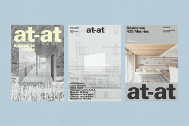
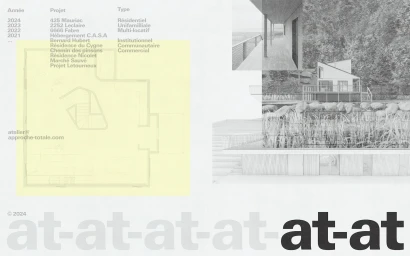
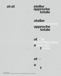
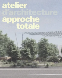
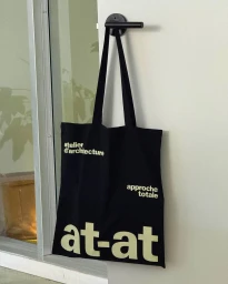
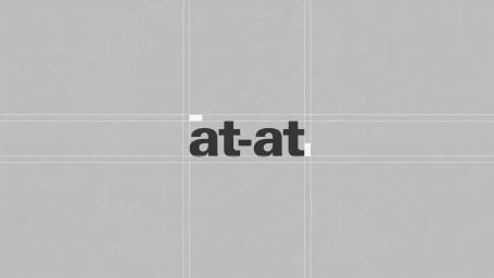
The brand identity for architecture firm at-at, developed by Demande Spéciale, centres on a clean, structural aesthetic that balances bold typography with architectural schematics. The project utilizes a restrained, muted color palette and grid-based layouts to establish a professional visual language across both digital and physical touchpoints. Dynamic motion sequences and static editorial compositions feature sans-serif typefaces alongside architectural photography, creating a cohesive, minimalist system. The identity extends into physical applications, including branded merchandise and printed materials, maintaining a consistent focus on geometric alignment and modular design principles.
Artistic, Vertical, Clean, Minimalist
Typography
