
Bas&Chris: Brand Identity

Brand
Date
Sep 2021
Description
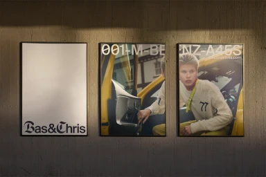
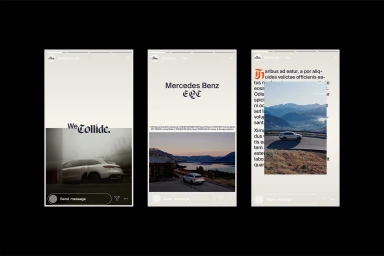
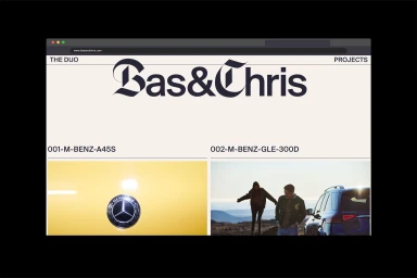
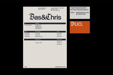
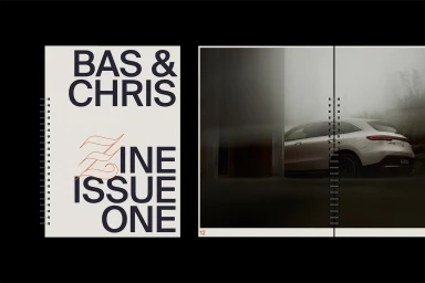
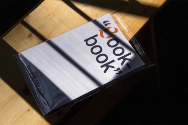
Design studio how by why delivers a comprehensive brand identity for automotive outfit Bas&Chris. The project leans into a clean, modern aesthetic that balances high-end automotive photography with bespoke graphic elements. The visual system makes use of structured grid layouts and a distinct interplay of minimalist sans-serif and gothic typography. Across both digital and print collateral—ranging from stationery and web interfaces to zine layouts—the brand employs a refined palette of cream, off-white, and vibrant orange accents to ground its industrial and commercial design language.
Style
Horizontal, Commercial, Clean, Minimalist
Techniques
Typography
Industries
Color
Pure White
Jet Black
Context
Website / Web
Associated creatives

5000+ creatives to discover
Sign up to gain access to the entire directory. It’s free.
Visie is a curated library of creative professionals.