
Alexander Bather: Brand Identity


Jul 2021
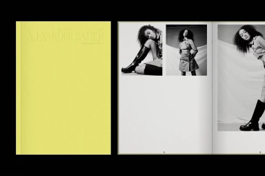
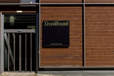
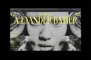
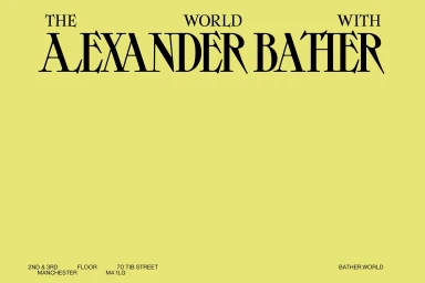
The brand identity project for Alexander Bather, developed by how by why, establishes a cohesive visual language across both physical and digital touchpoints. The work centers on a sophisticated serif typeface, deployed in a bold chartreuse and monochrome palette to maintain a clean, minimalist aesthetic throughout the various assets. The project encompasses a range of applications, including business stationery, printed editorial layouts, and architectural signage. A digital-first approach is evident in the smartphone mockups and browser-based interfaces, which integrate UI elements with editorial photography to extend the brand's graphic impact into social media and web environments.
Horizontal, Commercial, Clean
Typography
Website / Web
