
Bao & Bing: Brand Identity

Jul 2020
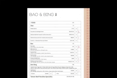
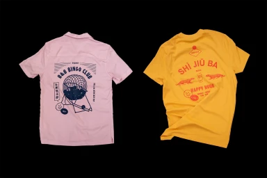
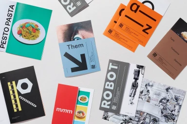
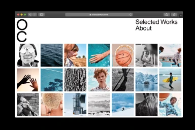
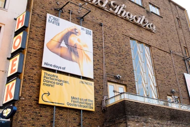
The brand identity for Bao & Bing captures a refreshing intersection of commercial design and tactile print culture, expertly curated to balance structural clarity with a sense of playful discovery. Through the collaborative efforts of Matinée Studio, Marx Design, and c_ll_ct_v_ly, the project transcends traditional corporate branding by layering clean, minimalist typography with unexpected graphic motifs. Each touchpoint, from the annotated menu designs utilizing distinct sections for Xiao, Bao, and Dan Bing to the vibrant, screen-printed apparel featuring whimsical illustrations, feels intentionally cohesive yet diverse. The execution leans into a rigorous approach to visual communication, utilizing high-contrast professional design and sharp typography to ground the brand. Whether manifest in the matte-textured exterior signage integrated into architectural lines or the dynamic use of natural light in their festival poster campaigns, the identity work emphasizes a bold, modern sensibility. The inclusion of UI illustration elements and diverse editorial booklets suggests a studio practice that values the tactile nature of paper stocks alongside the precision of digital interfaces. By combining these varied media applications, the project demonstrates how a strong brand framework can pivot seamlessly between print and digital, creating an immersive experience that is as much about the process of design as it is about the final consumer-facing result.
Clean, Horizontal, Commercial
Advertising Campaign


