
Australian Pavilion: Brand Identity

Oct 2019
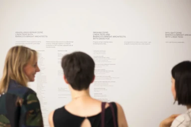
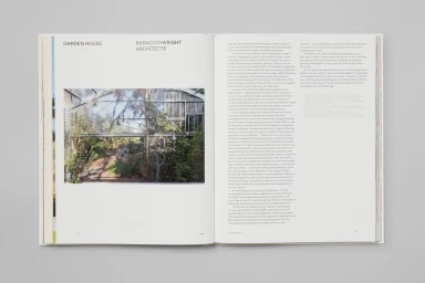
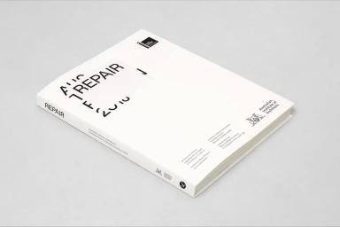
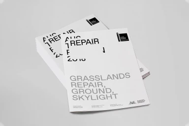
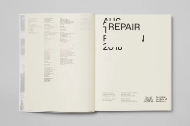
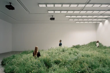
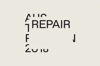
The brand identity for the Australian Pavilion serves as a masterclass in editorial minimalism, grounding a complex architectural narrative within a highly disciplined visual framework. Orchestrated by Studio Round, the project manifests as a cohesive ecosystem of printed ephemera, exhibition catalogues, and environmental graphics that bridge the gap between institutional authority and creative discourse. By leaning into a restrained, modern sans-serif typography, the design team creates a deliberate contrast between bold, black-on-white instructional clarity and the raw, organic presence of the installations themselves. The execution utilizes sophisticated production techniques, including tactile debossing on cream-colored stocks and structured, high-contrast layouts that honor the Pavilion's thematic focus on repair and environmental restoration. The result is a seamless corporate identity that functions as both a gallery-grade art object and an informative utility. Whether through the clean framing of the Grasslands Repair exhibition text or the strategic use of negative space in its collateral, the work captures a sense of institutional permanence. By utilizing live-action techniques and natural light in its documentary photography, the brand identity manages to elevate the exhibition experience, transforming raw project data into a sophisticated narrative package that speaks to the intersection of architecture, cultural policy, and high-end graphic design in the contemporary media and entertainment landscape.
Horizontal, Clean, Minimalist
Typography
