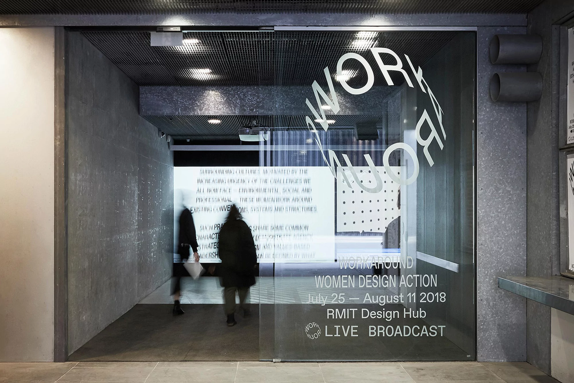
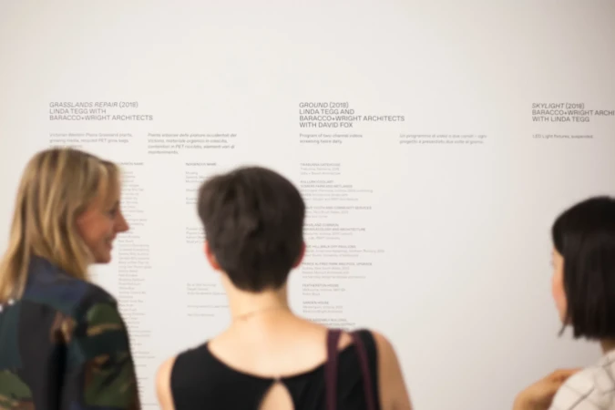
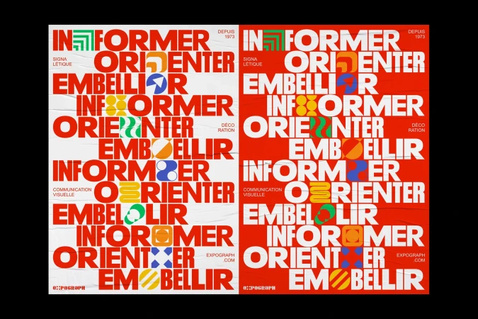
The brand identity project for RMIT Design Hub serves as a masterclass in spatial communication, masterfully bridging the gap between rigorous academic discourse and high-impact visual design. Orchestrated by Studio Round, the identity leans into a philosophy of editorial minimalism, where crisp sans-serif typography acts as both an architectural feature and an informational tool. Throughout the collateral, from tactile paper pamphlets to expansive digital display installations, the design language remains cohesive, utilizing a sharp monochrome palette that contrasts effectively against the hub's raw concrete and industrial textures. The project utilizes live-action techniques to integrate the human experience into the institutional space, capturing the transient nature of visitors navigating exhibition corridors adorned with rhythmic, graphic signage. By deploying bold UI illustrations and carefully curated typography, the identity transforms the physical environment into a dynamic narrative space. Whether it is a simple A-frame sign on a concrete landing or an intricate, backlit display wall, each element reinforces a sense of purposeful, professional branding. This work captures the intersection of contemporary design and institutional storytelling, proving that when graphic systems are applied with such precision, they do not merely decorate a space but actively define the cultural experience of those moving through it.