
APT.20: Brand Identity

Feb 2025
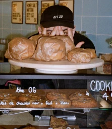
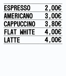
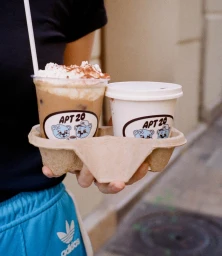
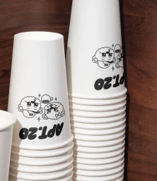
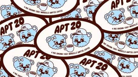
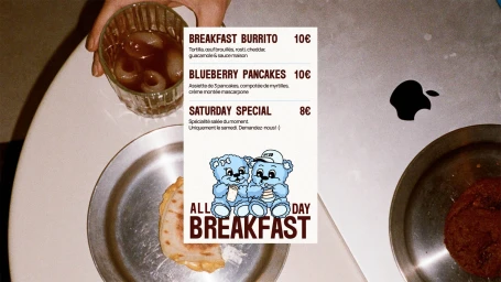
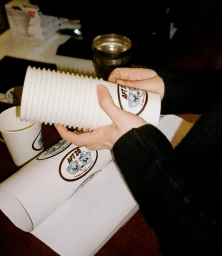
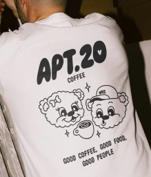
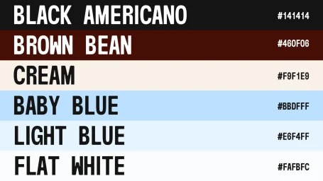
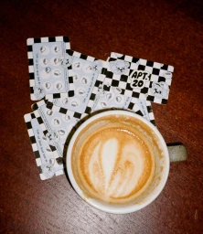
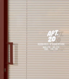
The brand identity for APT.20, a restaurant and food & beverage venture, centers on a playful yet minimalist visual language. Developed by PROST WORK, the graphic system integrates bold typography with recurring cartoon bear illustrations to create a distinct, approachable presence across both physical and digital assets. Karim Sirine captures the brand in situ through a collection of documentary-style photographs that emphasize a warm, candid dining atmosphere. The project incorporates a diverse range of deliverables, from functional packaging like branded coffee cups and takeaway carriers to an extensive loyalty program and menu signage. The aesthetic leans into a clean, modern commercial look, frequently utilizing analogue film techniques and natural light to maintain an authentic, editorial quality. This balance of vector-based illustration and film photography establishes a cohesive, nostalgic visual identity.
Advertising Campaign

