
Brand
ProjectBrand Identity
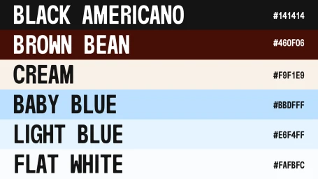
APT.20 Brand Identity 2025
Associated creatives


Tags
Description
This graphic displays the official brand identity colour palette for APT.20, featuring six distinct horizontal swatches accompanied by uppercase typography and corresponding hex codes. The palette includes shades titled Black Americano, Brown Bean, Cream, Baby Blue, Light Blue, and Flat White, arranged in stacked horizontal bands. Designed as part of a branding project by PROST WORK and Karim Sirine, the clean layout presents precise colour references for the project.