
Ancient Deities: Brand Identity
Sep 2020
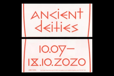
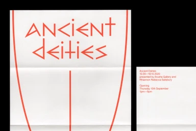
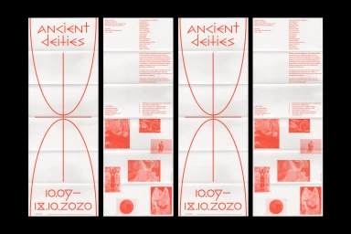
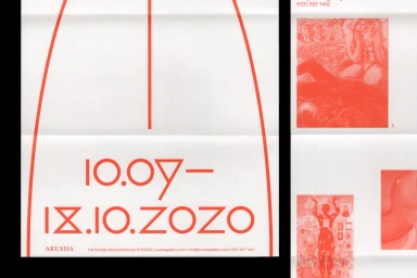
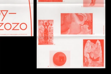
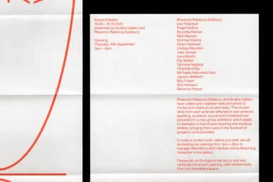
The brand identity for Ancient Deities masterfully bridges the gap between historical reverence and contemporary digital media aesthetics through a disciplined, high-contrast visual language. Designed by Callin Mackintosh, the project centers on an artistic and commercial fusion that relies heavily on strict, minimalist sensibilities. The identity is defined by a striking two-tone palette of saturated red ink against off-white, textured paper stock, creating a tactile experience that grounds the abstract graphic design in the physical world. Typography serves as the primary driver of the visual narrative; custom, sharp-angled geometric typefaces demand attention, providing a rigid, mathematical structure that contrasts beautifully with delicate, fine-line illustrations. The use of screen print techniques and intentional paper creases adds a deliberate, raw quality to the collateral, preventing the clinical perfection often associated with digital-first branding. By incorporating photographic inserts in monochromatic red tones and complex infographics, the work achieves a cohesive rhythm that feels both architectural and evocative. The project owner, Visie Admin, collaborated with Fedrigoni to select paper stocks that enhance this intentional interplay between negative space and bold mark-making. Ultimately, Ancient Deities stands as a masterclass in editorial minimalism, proving that when typography is treated as a primary graphic element, the resulting identity transcends mere information to become a visceral, curated exhibition experience.
Clean, Artistic
Typography, Screen print / silkscreen
Advertising Campaign

