
Aire: Brand Identity



Mar 2020
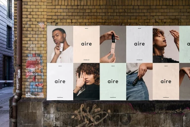
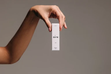
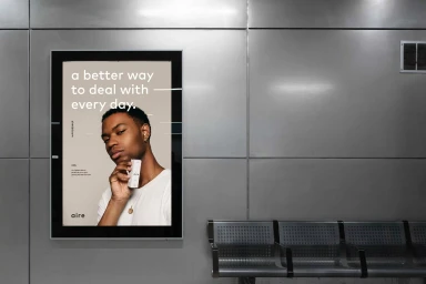
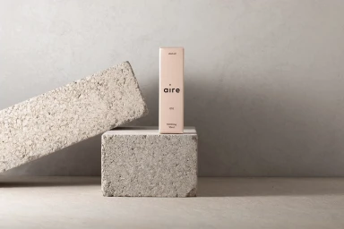
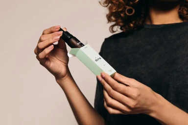
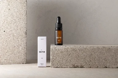
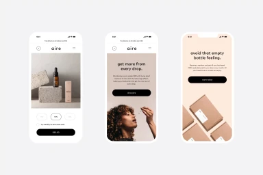
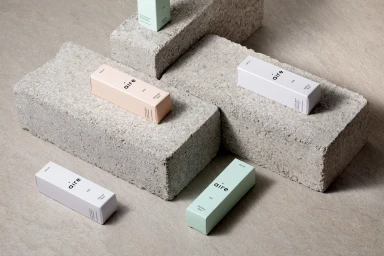
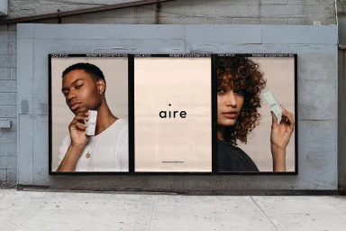
The brand identity project for Aire manifests a sophisticated intersection between clinical minimalism and approachable lifestyle branding, carefully curated to elevate the wellness experience through design. Executed with a keen focus on typography and intentional materiality, the visual system relies on a restrained palette of muted pastels and warm, neutral tones that feel both organic and contemporary. Through the lens of commercial lifestyle photography, the brand leans into a language of soft light and natural textures, positioning its skincare products against the raw, porous surfaces of concrete blocks to create a striking tension between industrial edge and refined elegance. The typography, characterized by a clean sans-serif typeface, maintains a consistent, professional presence across all touchpoints, from the tactile finish of the primary product packaging to the broader layout of mobile interface screens. Graphic design agency OH+CO successfully anchors the project in a cohesive aesthetic that feels both deliberate and versatile, allowing the brand to translate seamlessly from transit-station billboard installations to digital membership portals. By utilizing live-action techniques and a balanced, uncluttered composition, the project effectively communicates the brand ethos through a series of intentional visual moments, reinforcing a modern identity that prioritizes clarity, structural harmony, and a tactile, human-centric approach to consumer goods within the wellness space.
Horizontal, Commercial, Minimalist, Clean
E-commerce / Product
