
AFTRS: Brand Identity



Sep 2018
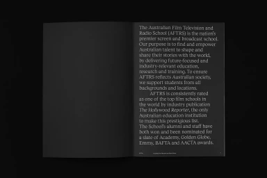
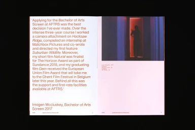
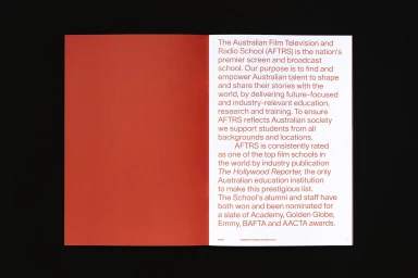
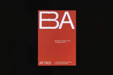
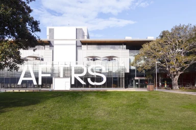
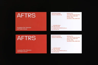
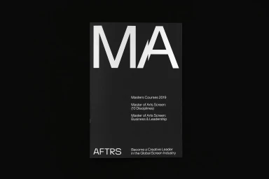
The brand identity overhaul for the Australian Film Television and Radio School (AFTRS) serves as a masterclass in corporate editorial design, demonstrating how institutional prestige can be translated into a modern, minimalist visual language. Executed by the creative team at M35, the identity leans into a bold, high-contrast aesthetic that prioritizes clarity and information hierarchy across both print and digital touchpoints. By employing a disciplined palette of deep charcoal, crisp white, and vibrant red, the project establishes a sophisticated academic presence that remains grounded in the realities of the contemporary digital media and entertainment landscape. The design system utilizes rigorous typography to anchor each medium, from the structured layout of academic brochures and business cards to the highly graphic, balanced compositions found on promotional posters and web interfaces. This systematic approach ensures that every piece of communication, including the thoughtfully integrated UI illustrations and commercial product photography, feels part of a cohesive institutional narrative. The reliance on negative space and clean, sans-serif letterforms allows the brand to project an image of professional authority without feeling overly traditional. Ultimately, the work frames AFTRS as a forward-thinking hub for storytellers, where the strength of the visual identity supports, rather than distracts from, the school’s mission to foster the next generation of creative leadership in the global screen industry.
Horizontal, Clean, Minimalist
Typography
