
Google: Brand Identity
Oct 2018
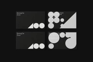
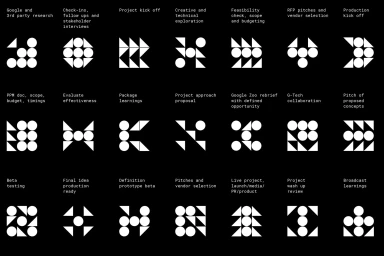
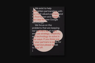
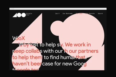
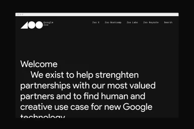
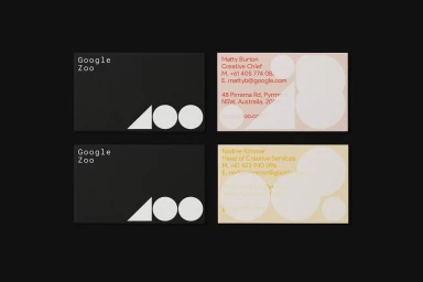
In a crowded landscape of digital platforms, the brand identity for Google Zoo cuts through the noise with an uncompromising commitment to minimalist corporate design. By leaning into a high-contrast aesthetic that pairs deep, matte black backgrounds with stark white and vibrant, soft-hued geometric accents, the identity system establishes a visual language that feels both authoritative and approachable. The project, meticulously executed by the design studio M35, centers on a refined modular grid where simple circles and triangles serve as the foundational building blocks for a broader UI illustration suite. This geometric approach extends seamlessly across every touchpoint, from the functional symmetry of their corporate stationery and business cards to the sophisticated architecture of their web landing pages. Typography plays a central role in this narrative, utilizing clean, sans-serif fonts to maintain absolute legibility while grounding the brand's mission statement in a modern, technical context. By integrating UI illustration and thoughtful vector graphics into a cohesive system, the branding strikes a balance between professional rigor and creative playfulness. The result is a highly structured identity that effectively communicates Google Zoo as a space for innovation, collaboration, and partnership, proving that the most memorable design often thrives on the art of strategic reduction and the power of consistent, intentional graphic execution.
Horizontal, Commercial, Clean, Minimalist
Typography, Vector
Black Seamless
