
Olympus
Brand Identity



Dec 2025
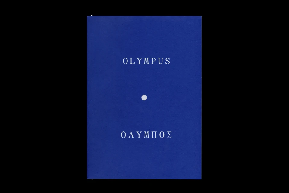
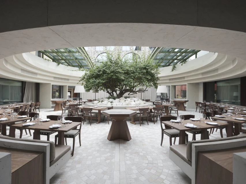
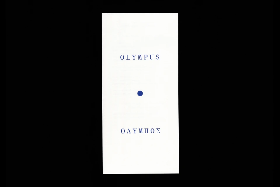
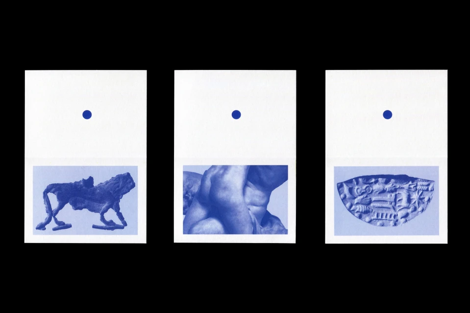
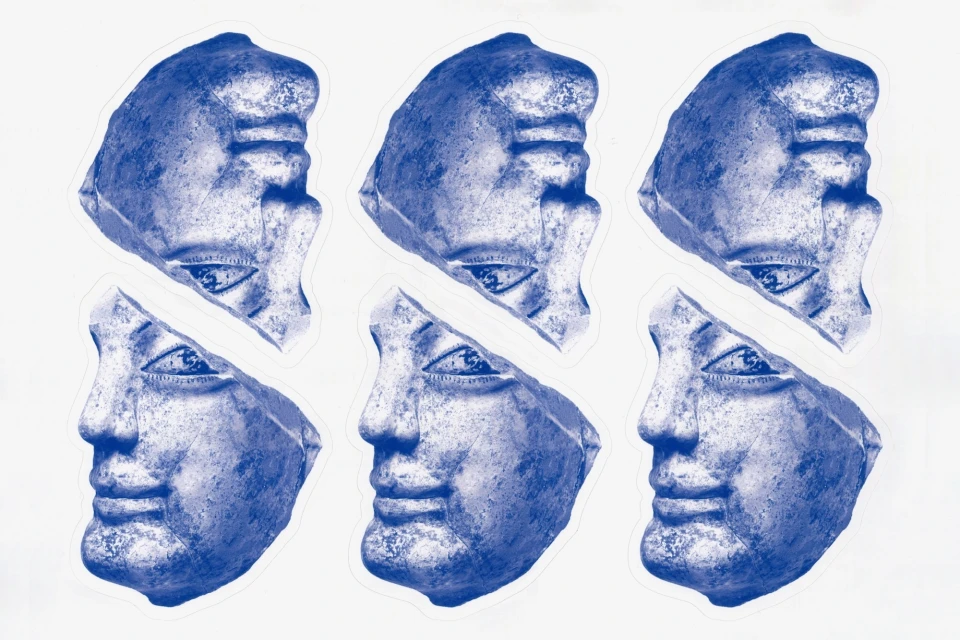
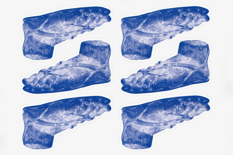
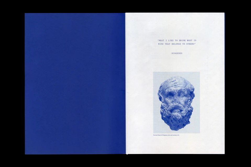
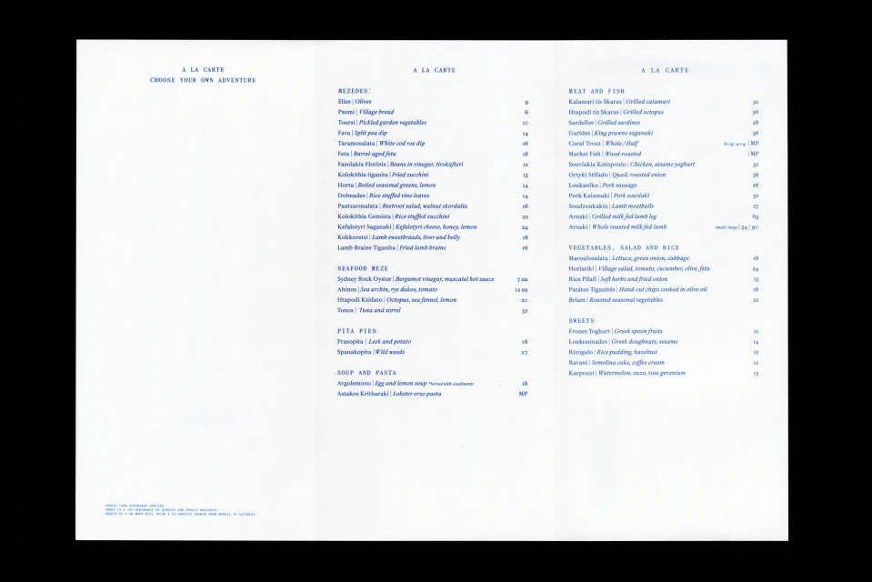
The brand identity for Olympus is a comprehensive design system that bridges classical aesthetics with contemporary corporate branding. Developed through a collaborative effort, the project encompasses editorial assets, spatial design, and digital architecture. The visual language centers on a monochromatic blue palette, utilizing high-contrast typography and minimalist layouts to ground the identity in clean, precise graphic principles. The project features work from M35, who provided the graphic design, and Tom Ferguson, who captured the brand imagery through both architectural photography and detailed editorial prints. Architect George Livissianis designed the physical space, while Liquid Protocol handled the web development. The output relies on techniques such as screen printing, intricate typography, and vector-based data visualisation, resulting in a cohesive brand identity that feels both historical and modern.
Clean, Horizontal
Typography
Advertising Campaign


