
unknown: Brand Identity

Apr 2020
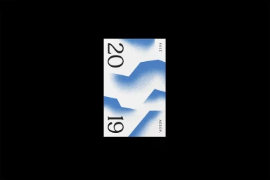
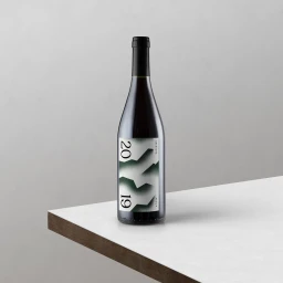
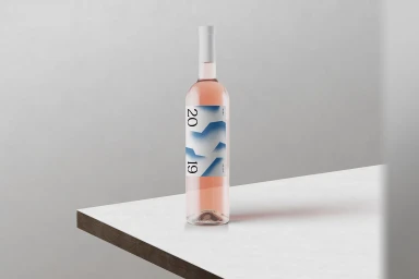
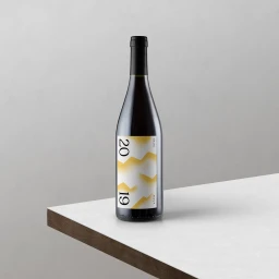
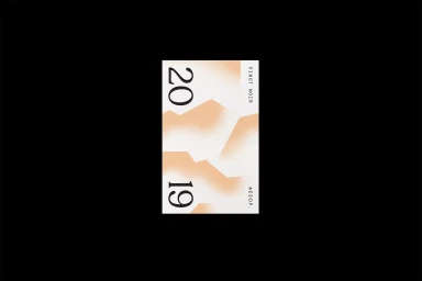
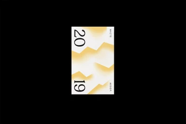
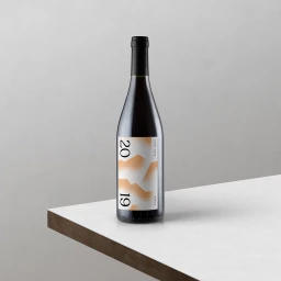
The brand identity developed for Aesop, spearheaded by the design studio CHEVAL, masterfully bridges the gap between traditional viticulture and contemporary graphic design. Through a series of labels and collateral, the project leans into a minimalist aesthetic that prioritizes high-contrast typography and intentional negative space. By utilizing bold, vertically oriented sans-serif and serif typefaces to display the vintage year, the design creates an immediate visual anchor, while abstract, soft-edged geometric shapes—rendered through varied textures like spray-paint, fine grain, and airbrushed layers—inject a modern, artistic sensibility into the overall presentation. This commercial work thrives on a stark palette, where crisp white surfaces and light-grey studio backdrops allow the product to breathe. Whether through the clean, cinematic soft light of the photography or the nuanced layering of vector elements, the identity feels both refined and conceptually deliberate. The interplay between the classic glass silhouette and the modern graphic application ensures that the brand remains memorable without relying on excess ornamentation. By integrating organic texture with strict geometric order, the project delivers a sophisticated look that feels perfectly suited for a premium market, reflecting a balanced approach to modern beverage branding that celebrates both form and function.
Vertical, Clean, Minimalist, Commercial
E-commerce / Product
