
Brand
ProjectBrand Identity
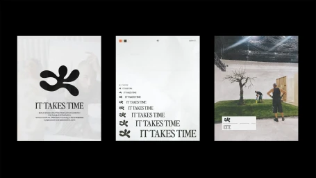
IT TAKES TIME Brand Identity 2025
Associated creatives

Tags
Description
This graphic design presentation displays a triptych of three visual boards detailing the brand identity for IT TAKES TIME, created by Moritz Kreul. The layout incorporates bold organic logo symbols, structured typographic hierarchy repeating brand messaging, and behind-the-scenes photography from a production set with artificial turf and a bare tree. The color palette relies heavily on stark contrasts of black and white across clean architectural compositions.