
IT TAKES TIME: Brand Identity

Aug 2025
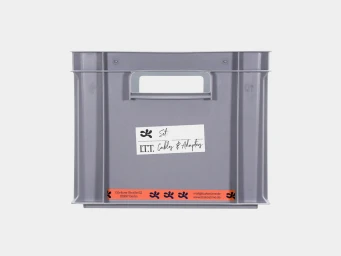
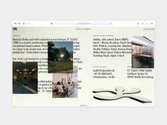
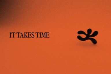
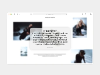
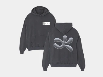
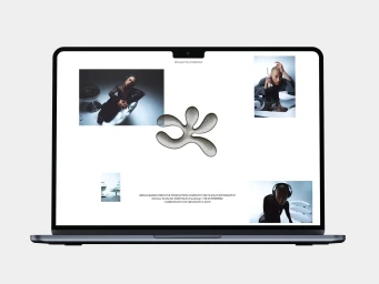
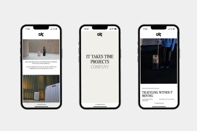
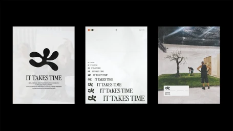
IT TAKES TIME, a Berlin-based creative production company specializing in film and photography, presents its comprehensive brand identity system designed by Moritz Kreul. The project establishes a cohesive visual language through a series of minimal, clean graphic assets that bridge digital interfaces with tactile, physical brand applications. The system utilizes a sophisticated typographic hierarchy, pairing elegant serif fonts with functional, structured layouts. Central to the identity is a recurring abstract organic logo mark that appears across both static print media and dynamic motion graphics. This central motif is adapted for diverse touchpoints, including UI illustrations for web and mobile platforms, apparel, and production equipment labeling. Techniques such as vector illustration, grainy texturing, and motion graphics are employed to build an aesthetic that is both functional and artistic. The identity maintains a monochrome palette across various commercial materials, ensuring a consistent brand presence.
Horizontal, Clean, Minimalist
Typography
