
Brand
ProjectBrand Identity
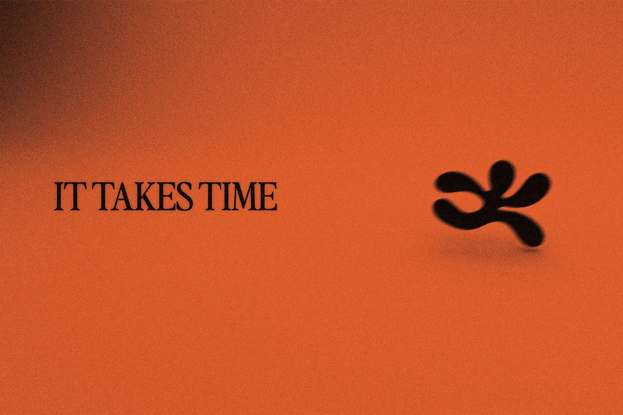
IT TAKES TIME Brand Identity 2025
Associated creatives

Tags
Description
This graphic design piece presents the brand identity for IT TAKES TIME, created by Moritz Kreul. The composition features serif typography on the left alongside a distinctive, abstract black organic shape positioned to the right. The entire scene is set against a warm, textured orange background with subtle grain. The minimalist layout balances clean lettering with organic form.