
FARE Brand Identity 2018
About
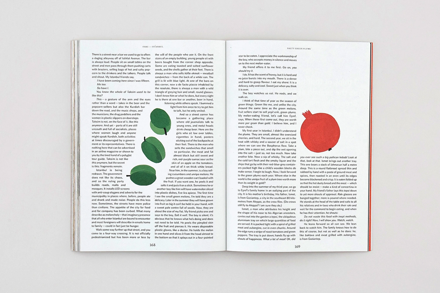
This open book spread for the FARE brand identity project showcases clean graphic design layout across two pages. The left page displays multiple columns of printed text interspersed with three illustrated green plums. The right page features a large, vibrant red pomegranate illustration alongside further text columns and page numbers. The book lies flat against a plain light background, highlighting its editorial typography and minimalist illustration style.
Brand
Project
Keywords
Credits
Styles
Techniques
Industries
Background
White Seamless
Context
Editorial