
Brand
ProjectBrand Identity
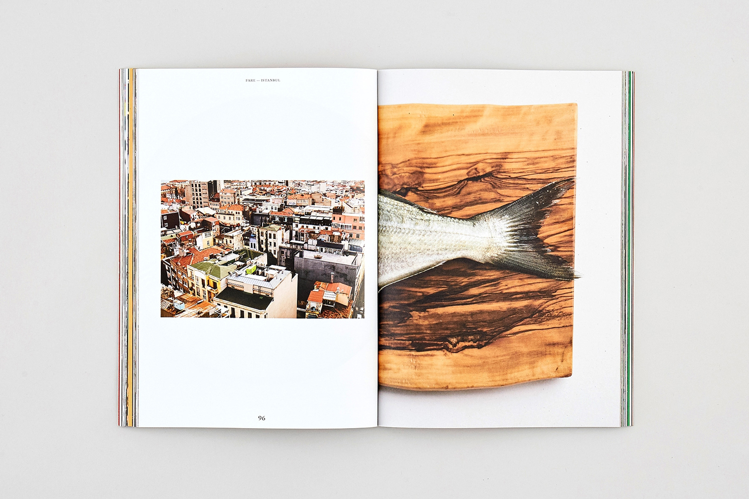
FARE Brand Identity 2018
Associated creatives

Tags
Description
An open magazine lies flat on a plain light grey surface, showcasing a two-page spread for the FARE brand identity project. The left page features a rectangular photograph of a dense urban cityscape with rooftops and buildings, accompanied by minimal headers and a page number at the bottom. The right page displays a close-up image of a fish tail resting on a richly textured wooden cutting board. The layout utilizes clean white negative space around the imagery, emphasizing the graphic design and editorial publication style.