
Associated creatives

Tags
Description
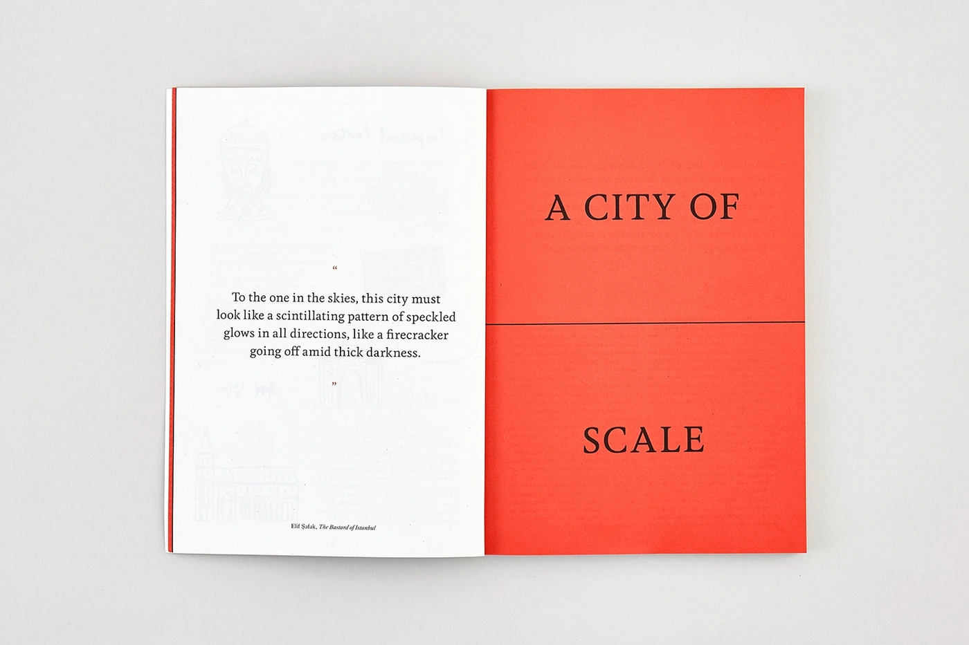
An open book rests flat against a clean, neutral surface, presenting a balanced two-page editorial spread for the FARE brand identity project. The left page features crisp black typography with a literary excerpt alongside faint, subtle outline illustrations. The right page is a vivid, solid red block with centered serif text reading A CITY OF SCALE. The composition emphasizes clean graphic layout, strong color contrast, and refined typography. The lighting is even and flat, accentuating the matte paper texture and crisp print quality.