Paco Rabanne
Featured Paco Rabanne projects
This week's top Paco Rabanne projects, carefully handpicked by Visie's expert curators, showcase the best in style and innovation.
Paco Rabanne · Invictus
 Project
 Paco Rabanne · Brand Identity
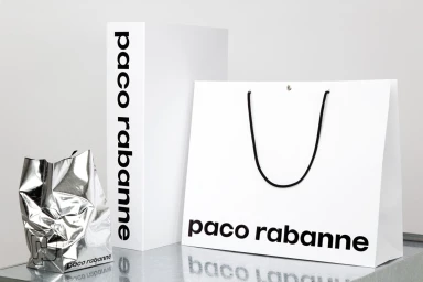
In a masterclass of luxury fashion house branding, the recent visual identity project for Paco Rabanne strips back the ornate to reveal a core of precise, graphic architecture. Crafted with graphic design by Zak Group, the project moves away from fleeting trends, instead leaning into a rigorous, minimalist aesthetic that defines the house through its typography and material contrast. The series of assets employs a clean, high-key studio strobe lighting scheme to emphasize the stark interplay between matte white surfaces and sharp, black sans-serif lettering. By incorporating tactile elements—such as strategically placed black rubber bands and unexpected red halftone patterns—the work creates a tangible, utilitarian dimension within an otherwise corporate framework. From the structured elegance of the visual identity guidelines binder to the carefully considered packaging composition, the project highlights a commitment to institutional consistency. The use of minimalist packaging and bold, legible typography acts as a direct dialogue between the brand's storied history and its modern, sleek iteration. This identity system reads as a deliberate exercise in editorial minimalism, where every element, from the vertical elastic straps on collection booklets to the reflective quality of metallic shopping bags, serves to reinforce the brand's renewed, refined visual language, proving that in the world of high fashion, true luxury is often found in the most disciplined design.
 Project
 Paco Rabanne · Brand Identity
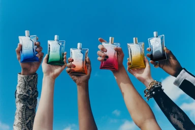
Paco Rabanne redefines its brand identity through a sophisticated visual narrative that masterfully balances high-end fragrance luxury with an industrial, laboratory-inspired edge. This comprehensive creative project captures the essence of the brand through a dual approach: evocative lifestyle imagery and clinical, product-focused macro studies. By juxtaposing the polished, metallic reflections of their signature fragrance bottles against vacuum-sealed sachets of raw organic ingredients like ginger, vanilla, and fresh herbs, the execution leans into a tension between the man-made and the natural. Schelten & Abbenes demonstrate meticulous technical precision in these studio setups, utilizing soft light to emphasize the interplay between glossy metallic textures and transparent, grid-patterned surfaces. Complementing these commercial product shots, campaign photography by Stef Mitchell introduces a human element, anchoring the metallic aesthetic in real-world contexts through cinematic portraiture that prioritizes mood and tactile fashion details. The integration of graphic design work by Zak Group ensures that the brand remains cohesive, sharp, and intentional. This visual strategy effectively communicates a modern luxury aesthetic that is both clinical and vibrant, positioning the brand firmly at the intersection of beauty and innovation. By blending editorial minimalism with commercial utility, the project serves as a compelling study in contemporary brand building, elevating the physical product into an object of desire through a sharp, polished, and highly stylized visual lens.
Explore other Fragrance brands
Explore Visie’s leading industries, projects, and the talented creatives representing them.