
World Aeropress Championships: Brand Identity


Jun 2024
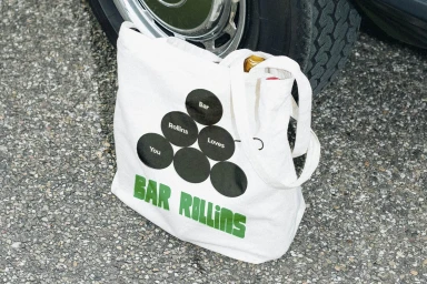
The World Aeropress Championships brand identity project presents a cohesive visual language across a range of commercial and editorial assets. The execution leverages playful typography and a vibrant, warm color palette to establish a distinct presence for the global coffee community. Developed by a collaborative team including Angel & Anchor, Odd Hours Studio, Wedge, Saint-Urbain, and Studio Gonzalo Hergueta, the identity integrates motion graphics and tactile product photography. The project features clean, minimalist compositions that highlight custom apparel and branded merchandise, emphasizing natural light and grainy textures to ground the graphic design elements in a realistic context.
Horizontal, Clean, Commercial
Advertising Campaign


