
World Aeropress Championships: Brand Identity






Oct 2023
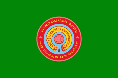
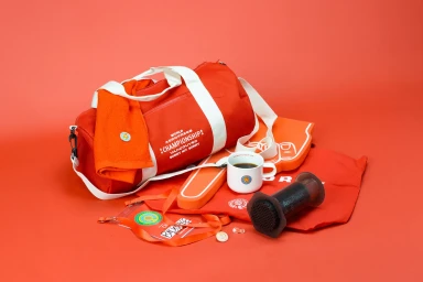
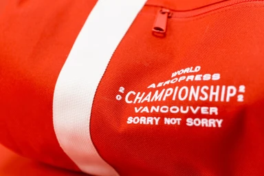
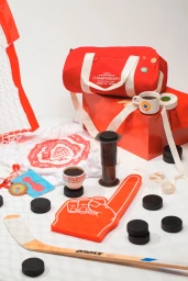
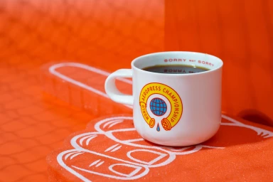
The brand identity for the World Aeropress Championships, developed by Angel & Anchor and Shane Gallagher, captures the competitive spirit of the global event through a vibrant, graphic-led design system. The project spans visual identity, merchandise, and promotional photography, utilizing a bold color palette of red, yellow, and blue to anchor the branding across various physical and digital assets. The execution leans into a blend of commercial graphic design and documentary-style photography. Key elements include custom trading cards for coffee champions, isometric illustrations, and product shots that highlight tactile materials like embroidered denim and woven textiles. With a consistent use of clean vector lines and bright, high-contrast studio lighting, the identity integrates sports-themed iconography—such as hockey motifs—with professional coffee brewing equipment to represent the event’s unique culture.
Commercial, Horizontal
Advertising Campaign

