
Wintercircus: Brand Identity
Apr 2024
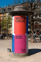
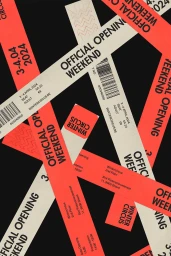
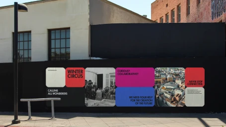
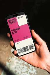
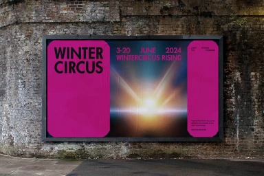
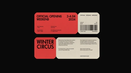
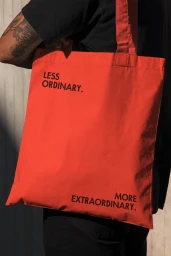
The brand identity for Wintercircus functions as a large-scale exercise in urban placemaking and graphic communication. Developed by Zware Jongens with interior design contributions from OYO Architects, the identity utilizes a high-contrast palette of red, magenta, and blue to transform public infrastructure into a cohesive visual landscape. The design system leans into bold, sans-serif typography paired with historic photography to anchor the brand within the urban environment. Techniques such as motion graphics and clean, vector-based layout design extend the identity across physical and digital touchpoints. From large-format outdoor hoardings and illuminated metro lightboxes to tactile printed event tickets and promotional merchandise, the work establishes a recognizable presence throughout the city. The execution focuses on clear information hierarchy and rhythmic color blocking to integrate the brand into diverse public settings.
Clean, Commercial

