
UNTO: Brand Identity
Jul 2025
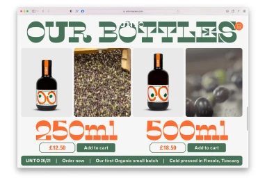
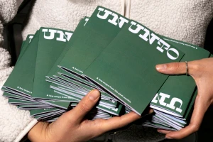
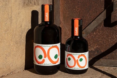
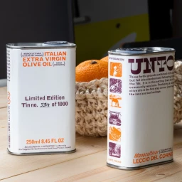
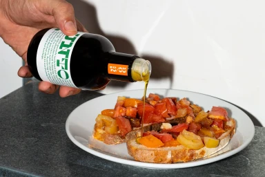
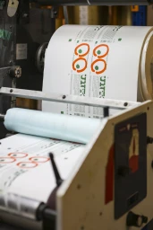
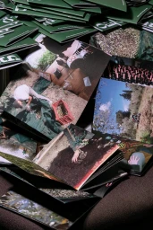
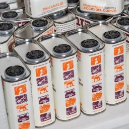
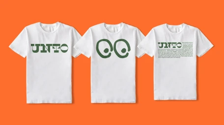
Studio Bergini leads the brand identity project for UNTO, an e-commerce platform and product line within the food and beverage industry. The identity relies on bold, decorative typography paired with a high-contrast palette of green and orange to communicate the brand's organic positioning across both digital and physical touchpoints. The visual system extends across a diverse range of assets, including minimalist web interfaces, custom product packaging for glass bottles and metallic tins, and collateral such as editorial booklets and apparel. Techniques such as clean graphic layout, vector illustration, and crisp product photography define the brand’s aesthetic, capturing the textures of the olive oil and its culinary applications through both natural light and controlled studio flash.
Commercial, Clean, Horizontal, Warm
