
Brand
ProjectBrand Identity
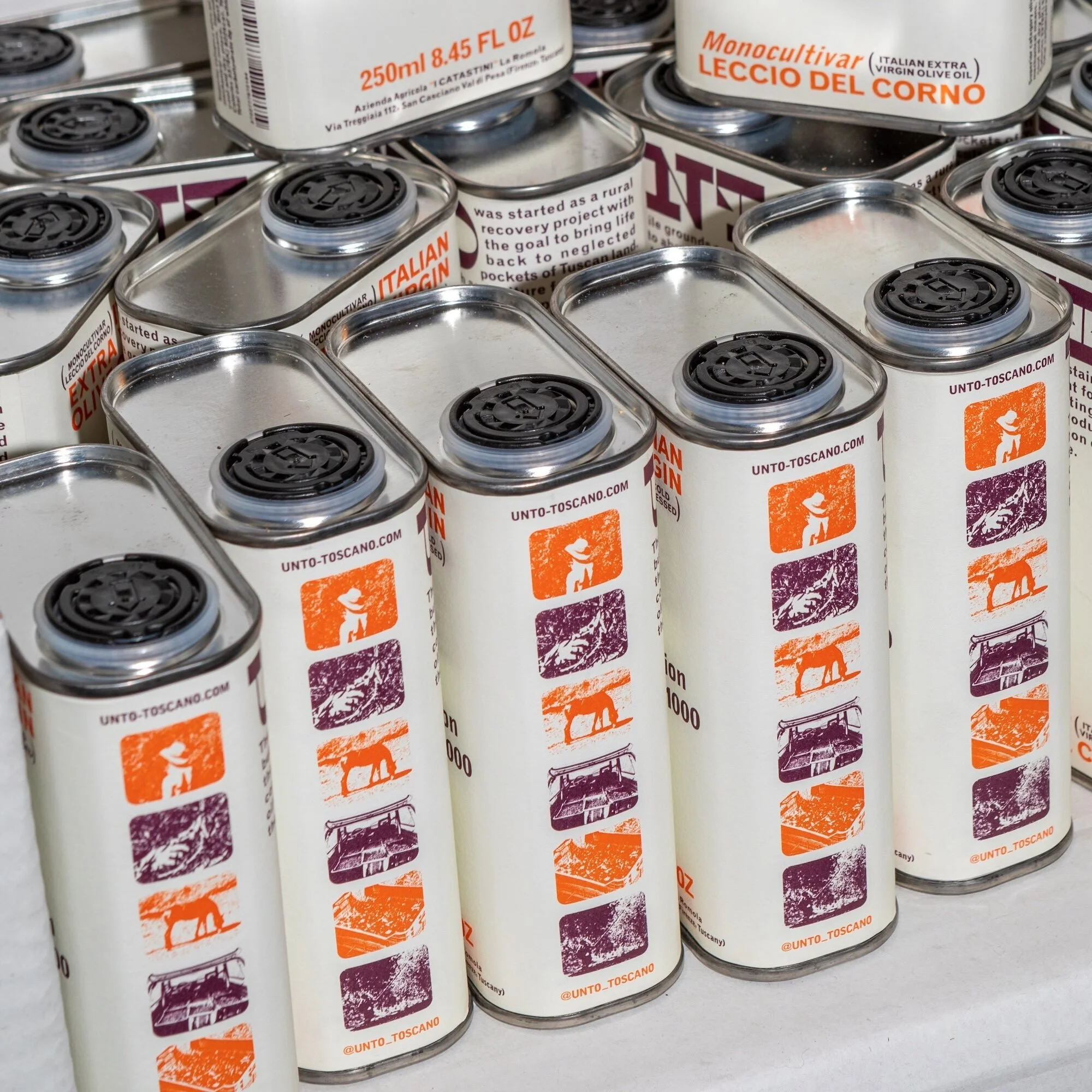
UNTO Brand Identity 2025
Associated creatives

Tags
Description
A close-up view captures an arrangement of rectangular metal olive oil tins, each featuring white labels adorned with orange and purple graphic panels, black screw caps, and branding details for UNTO. The tins are tightly packed together, creating an overlapping geometric composition with soft natural lighting highlighting the metallic sheens and printed details. Studio Bergini contributed graphic design for the project, showcasing clean product packaging aesthetics. The shallow depth of field keeps the foreground tins in sharp focus while the background recedes softly.