
unknown: Brand Identity
Feb 2024
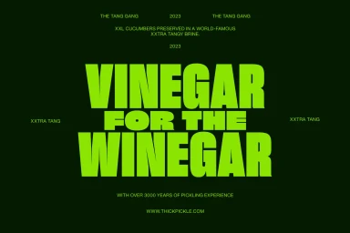
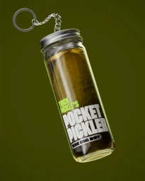
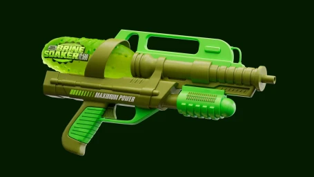
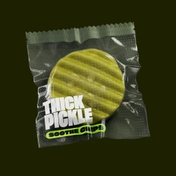
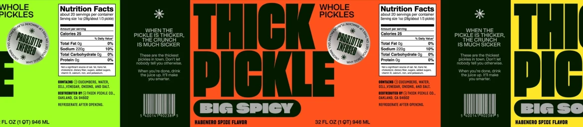
Thick Pickle establishes a bold market presence through a comprehensive brand identity that utilizes high-contrast color blocking and assertive, condensed typography. The visual language centers on a vibrant palette of neon and olive greens, applied across diverse assets ranging from packaging design to novelty product visualizations. The project integrates 3D render and CGI techniques to bring the product line to life, featuring meticulously detailed renderings of pickled goods and stylized promotional items. Kinetic typography and motion graphics underscore the brand’s high-energy positioning, while consistent graphic design elements maintain a clean, commercial aesthetic throughout the range of print and digital deliverables. Creative execution was led by Study Hall, who provided graphic design and 3D services, alongside 3D artist Jacob Frommer and web developer Lucas Vallenet.
Horizontal, Commercial
3D render / CGI
Solid Colour


