
unknown: Brand Identity
Feb 2020
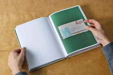
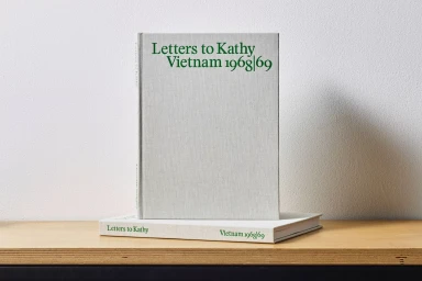
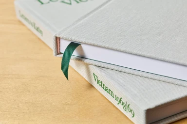
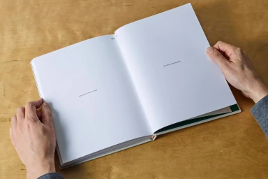
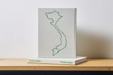
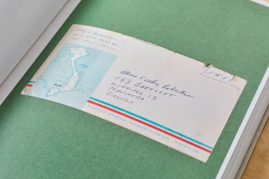
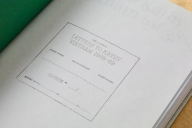
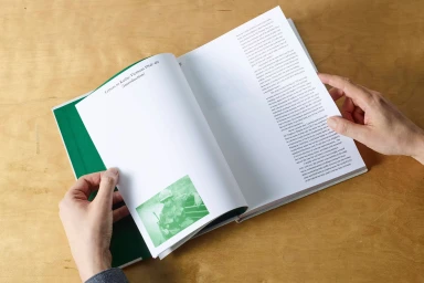
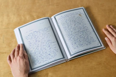
The brand identity for Letters to Kathy Vietnam 1968-69 serves as a masterclass in minimalist design, bridging the gap between historical documentary and contemporary publishing within the media and entertainment sector. Crafted with precision by Studio Lowrie, the identity leans into editorial minimalism to honor the weight of personal correspondence. The project centers on the physical artifact, utilizing a restrained palette of light grey linen and deep, saturated green to create a tactile, premium experience. Through high-level commercial photography, the work highlights the deliberate material choices—from the embossed serif typography on the cloth-bound covers to the delicate placement of ephemera like vintage airmail envelopes. The visual execution relies on natural light and soft light techniques, ensuring the focus remains on the historical integrity of the documents rather than extraneous embellishments. Every detail, from the macro-lens captures of the bookplate typography to the overhead lifestyle shots of the handwritten pages, reinforces a sense of archival permanence and professional craftsmanship. By prioritizing clean, symmetrical compositions, the project successfully elevates a personal narrative into a sophisticated, collectible object, proving that intentional design is the most powerful tool for storytelling in the digital media age. The resulting aesthetic feels both timeless and grounded, perfectly capturing the intersection of historical research and modern book design.
Editorial, Horizontal, Clean
Wood Texture
Editorial
