
unknown: Brand Identity

Feb 2020
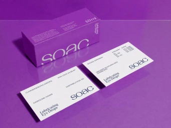
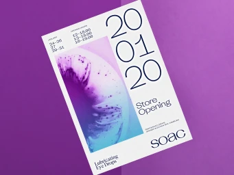
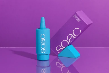
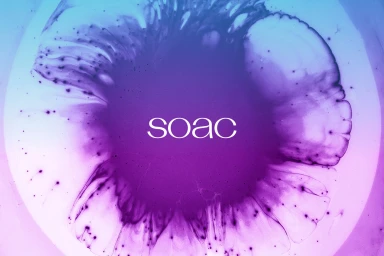
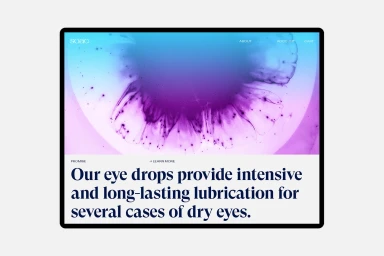
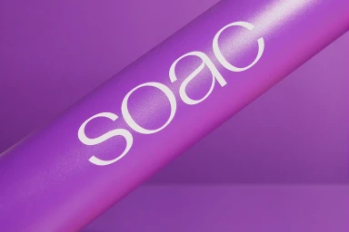
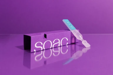
The brand identity for SOAC, expertly crafted by graphic designer Rasmus Und Christin, masterfully bridges the gap between clinical reliability and contemporary art. By leveraging a high-contrast palette of saturated purple and electric cyan, the project establishes a distinct visual language that elevates mundane eye care products into a cohesive lifestyle experience. The design system leans heavily into a clean, modernist sensibility, where the consistent use of a sharp, sans-serif wordmark becomes the anchoring point across various touchpoints. From the structured, minimalist packaging to the fluid, abstract macro photography depicting ink dispersing in water, the identity balances rigorous geometric order with organic, tactile movement. This dual approach ensures the brand feels both scientifically precise and creatively bold. The integration of UI illustration throughout the digital mockups reinforces this professional edge, demonstrating a clear focus on user experience and brand clarity. By utilizing cinematic lighting and intentional negative space, the composition transforms standard product photography into a sophisticated showcase of materiality. Ultimately, this comprehensive identity system avoids the sterile tropes of the pharmaceutical industry, opting instead for an editorial aesthetic that feels both approachable and high-end, proving that even the most functional categories can benefit from a thoughtful, design-led creative strategy.
Horizontal, Commercial, Clean
Solid Colour
