
unknown: Brand Identity
Sep 2019
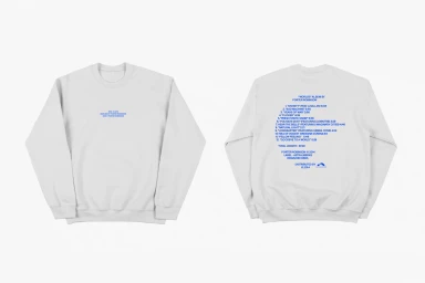
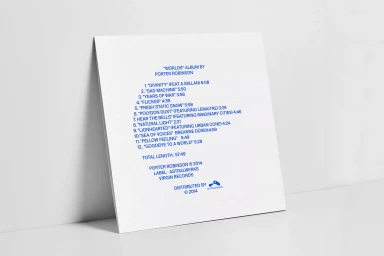
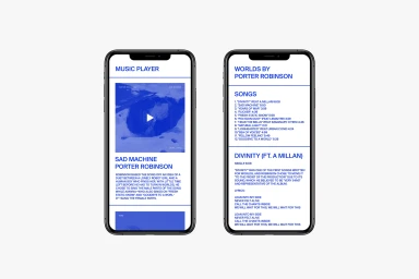
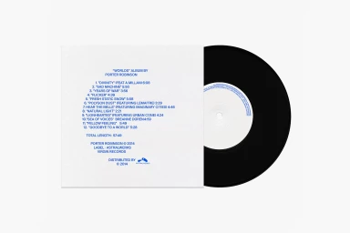
This brand identity project for Porter Robinson serves as a masterclass in editorial minimalism, grounding the emotive nature of the Worlds album within a crisp, highly structured visual system. By utilizing a stark white-and-blue color palette, the identity leans into a clinical, modern aesthetic that prioritizes clarity and information design above all else. The project, which spans both physical merchandise and digital interface development, relies heavily on the strength of its typography to convey authority. Graphic designer Marco Cofrades demonstrates a keen eye for balance, utilizing soft light and bright, even exposure to highlight the texture of fabric on apparel while maintaining the rigorous precision required for UI illustration. Whether presenting the tracklist on a crewneck sweatshirt or mapping out a mobile music player application, the design consistently employs a grid-based approach that feels both functional and timeless. The use of clean sans-serif typefaces across both vinyl record packaging and digital screens ensures a cohesive brand language that remains legible and professional. By stripping away extraneous noise, this commercial concept achieves a high-key visual purity, transforming standard promotional materials into a deliberate extension of the artist's brand. It is an exercise in restraint where every element, from the alignment of text to the placement of physical assets, functions in service of a unified, minimalist corporate identity.
Horizontal, Commercial, Clean, Minimalist
White Seamless
