
unknown: Brand Identity
Sep 2019
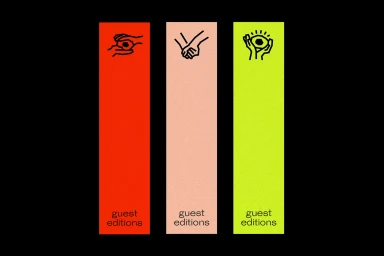
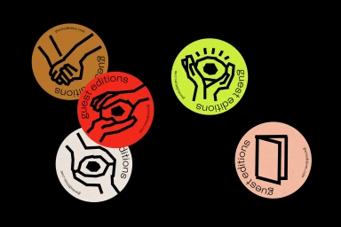
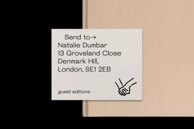
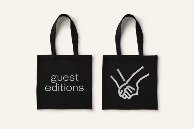
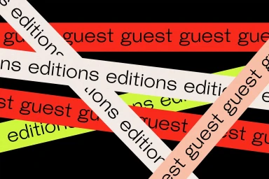
The brand identity for Guest Editions, executed by Studio Thomas, serves as a masterclass in modular graphic design and cohesive visual storytelling. By leaning into a sophisticated language of abstraction, the project utilizes a high-contrast palette of neon lime, saturated orange, and stark black to ground its minimalist aesthetic. The system thrives on a consistent, repeatable iconography featuring hand-drawn style illustrations that interact with geometric shapes, effectively bridging the gap between artistic expression and commercial application. Through the use of clean typography and structured vector layouts, the design maintains a rigorous sense of symmetry that allows the brand to transition seamlessly across various touchpoints, from functional mailing inserts to physical merchandise like matte black tote bags. The inclusion of UI illustration elements adds a tactile, contemporary edge, reinforcing a professional yet approachable identity that feels both organized and dynamic. By emphasizing clear visual hierarchies and bold line-art, the work successfully builds a recognizable shorthand for the brand, proving that minimalist design can be deeply expressive. The resulting identity is not merely a logo, but a functional, versatile system that celebrates clarity and purposeful composition within a modern design framework, perfectly exemplifying the power of a unified visual strategy in today’s competitive creative landscape.
Artistic, Clean, Graphic, Horizontal
Typography
Black Seamless
