
the world’s largest music publisher
Brand Identity






Sep 2026
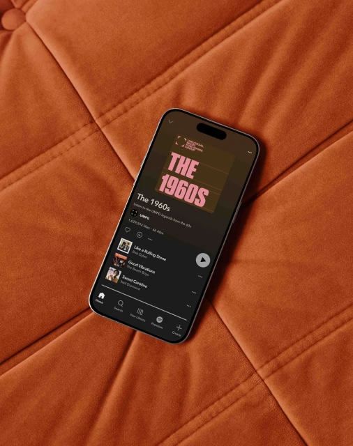
Universal Music Publishing Group's brand identity system establishes a modern, corporate visual language that anchors its vast catalog in contemporary graphic design. Developed by GrandArmy, Ian Crane, and James Stuart, the project spans static posters and motion graphics, utilizing bold typography and minimalist grids to highlight artist portfolios and corporate messaging. The execution relies on a high-contrast palette and clean vector animation, moving between dark, textured environments and vibrant pastel color blocks. By integrating kinetic typography with photographic portraits of featured songwriters and artists, the system balances a corporate tone with the creative nature of music publishing. Across digital streaming interfaces and physical outdoor advertising, the identity maintains consistency through structured layout principles and precise motion graphics.
Commercial, Horizontal
Music


