
The Florian: Brand Identity
May 2026
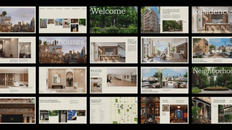
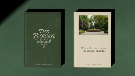
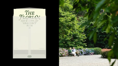
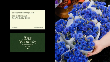
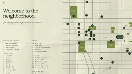
The branding for The Florian in Gramercy Park masterfully blends the stark, structured precision of high-end corporate identity with the organic, tranquil atmosphere of its Manhattan setting. Through a comprehensive suite of collateral—ranging from tactile, forest-green hardcover books to an intuitive web interface—the project establishes a visual language defined by editorial minimalism and sophisticated typography. The design team, led by Watson, leans into a palette of muted earth tones and elegant serif fonts to evoke a sense of quiet luxury, effectively grounding the residential property in the historic character of its neighborhood. This commercial endeavor balances the technical rigors of UI illustration and grid-based mapping with the human element captured in Ryan Neeven’s photography, which highlights the lush, verdant beauty of the surrounding gardens. By juxtaposing sharp, directional lighting against soft paper textures and clean sans-serif layouts, the identity feels both timeless and grounded in the present. Whether through the clean lines of a neighborhood guide or the thoughtful arrangement of florist-inspired ephemera, The Florian project creates a cohesive brand experience that elevates real estate marketing. The integration of editorial photography and motion-led animation adds a layer of depth, ensuring that the brand’s promise of refined urban living is communicated with clarity and grace across every touchpoint, from physical stationery to the digital realm.
Horizontal, Clean, Minimalist, Commercial
Solid Colour

