
Studio Ima: Brand Identity
Jan 2019
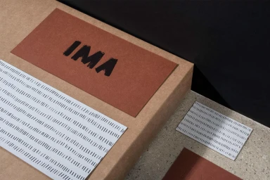
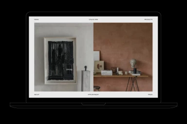
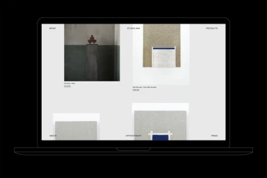
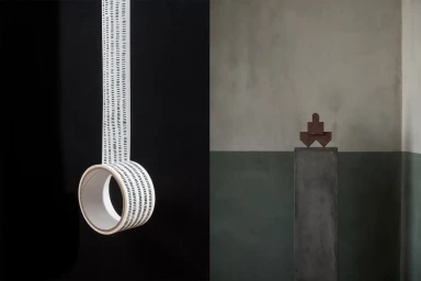
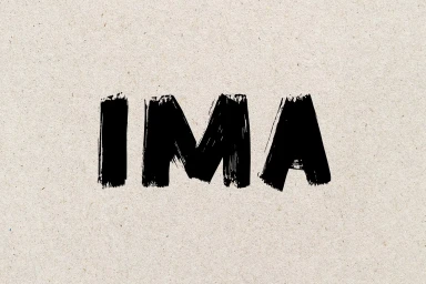
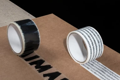
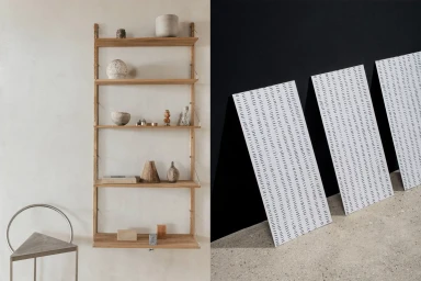
The brand identity project for Studio Ima, masterfully executed by the design team at StudioSmall, represents a masterclass in minimalist design and tactile storytelling. By bridging the gap between raw organic textures and precise, architectural form, the identity successfully captures an aesthetic that feels both elevated and grounded. The visual language centers on a sophisticated tonal palette of terracotta, warm wood, and neutral beige, which is perfectly punctuated by the sharp, gestural intensity of hand-painted brush-stroke typography. Utilizing a clean, grid-based approach across both physical collateral and digital UI illustration, the project leans into a narrative of intentional restraint. The interplay of commercial photography and graphic design is seamless, with the work featuring strategic use of natural light and hard light to emphasize the physical properties of paper, stone, and synthetic materials. Whether showcased through textured stationery on corrugated cardboard or within a refined, split-screen website interface, every touchpoint reinforces the brand's commitment to clarity and negative space. By layering tiny black vertical line motifs against clean, sans-serif layouts, StudioSmall has crafted a cohesive brand identity that feels curated rather than constructed. This is a quintessential example of corporate branding that prioritizes materiality and composition, proving that when typography and texture are handled with such deliberate precision, the resulting design language speaks with an enduring and authoritative visual voice.
Horizontal, Commercial, Clean, Minimalist
Advertising Campaign
