
Blackhorse Lane Ateliers
Brand Identity
Mar 2017
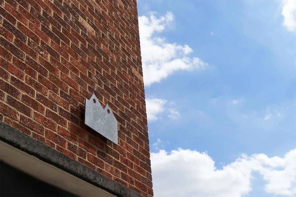
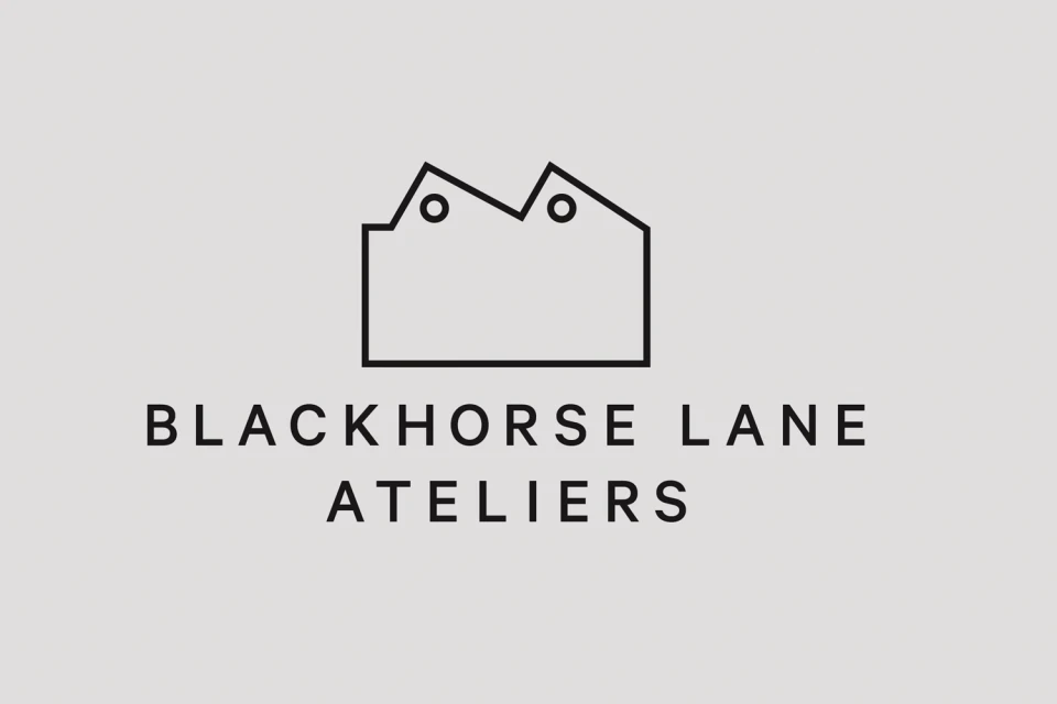
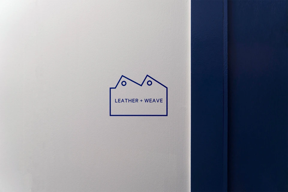
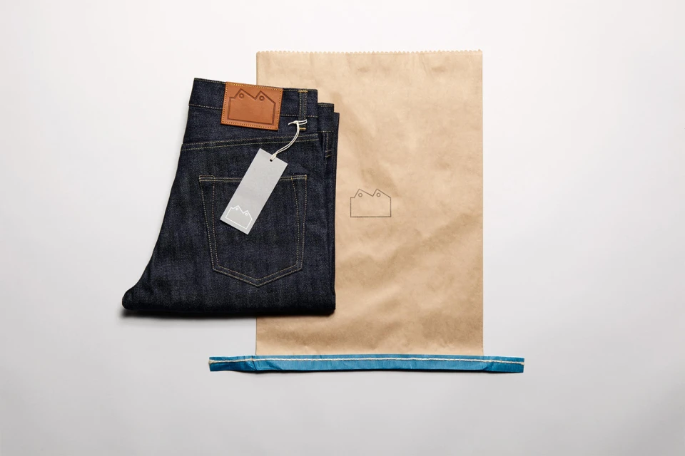
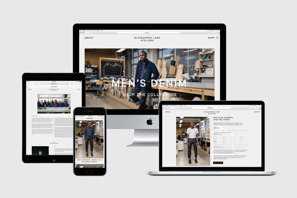
Blackhorse Lane Ateliers establishes a formidable presence through a comprehensive brand identity that masterfully bridges industrial heritage with modern, minimalist refinement. The design language, expertly crafted by StudioSmall, leans into the architectural history of the brand by utilizing a signature sawtooth roofline motif. This core visual element manifests across multiple touchpoints, from exterior metallic signage bathed in natural light to the stark, high-contrast vector graphics that define the brand's digital and interior spaces. By maintaining a cohesive aesthetic, the identity balances the raw, tactile quality of premium raw denim—captured in studio strobe photography that emphasizes deep indigo textures and tan leather details—with the clean, structured precision of contemporary web design. This cross-platform consistency is evident in the responsive digital interface, which frames the workshop experience within a sophisticated, corporate-ready layout. The result is an evocative narrative of craftsmanship, where typography and structural geometry work in tandem to convey authenticity. Through thoughtful application of 3D render and CGI techniques alongside traditional commercial photography, the brand identity project succeeds in positioning the atelier as a forward-thinking entity that respects its industrial roots. This balance of minimalism and materiality ensures that every application, whether on a stark white wall or a portable device, reinforces the core promise of the Blackhorse Lane Ateliers label with clarity and professional rigor.
Commercial, Clean, Minimalist, Horizontal
High Street Fashion
