
Stolp: Brand Identity

Mar 2023
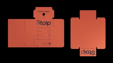
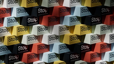
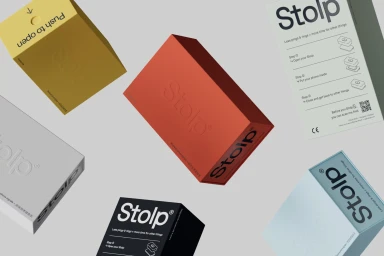
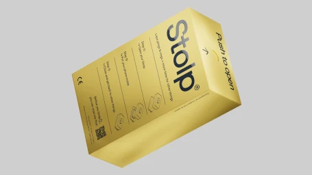
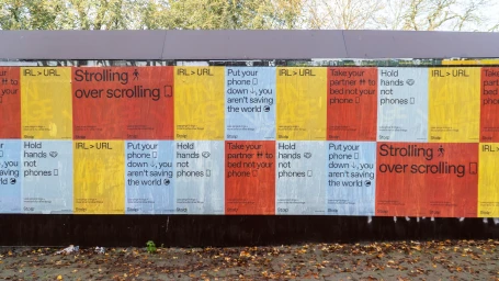
The brand identity for Stolp establishes a clear, utilitarian visual language rooted in geometric precision and minimalist typography. Developed by FCKLCK, the project centers on a functional aesthetic that emphasizes clean layouts, typographic hierarchy, and a modular approach to packaging design. The identity system utilizes a distinct color palette—spanning sage green, coral, mustard, and monochrome—to differentiate product applications while maintaining brand consistency. Technically, the execution leans into motion graphics and 3D rendering to showcase structural integrity. The use of vector-based animation and isometric line art clarifies the user experience, while the static brand assets employ techniques like emboss and deboss to add depth to the matte packaging. By integrating structural construction grids with sans-serif typography, the identity achieves a balance between instructional clarity and modern graphic design.
Horizontal, Commercial, Clean, Minimalist
