
so&so: Brand Identity




Nov 2019
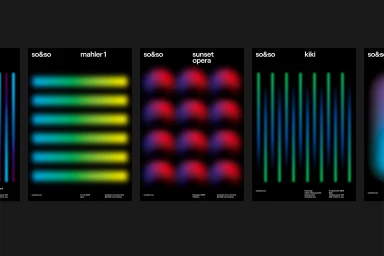
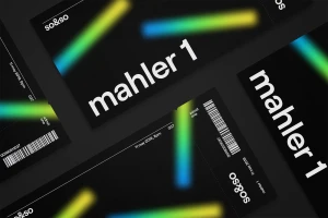
The brand identity for so&so emerges as a masterclass in modern visual communication, expertly balancing minimalist rigor with a high-octane color palette. Orchestrated by FAY, the design system utilizes a sophisticated dark aesthetic, employing deep black backgrounds to amplify the luminosity of vibrant neon green, blue, and purple gradients. This high-contrast approach creates a distinct visual language that feels both timeless and forward-thinking, whether applied to static event collateral or dynamic digital interfaces. The identity leans into editorial minimalism, favoring clean sans-serif typography that ensures clear information hierarchy while maintaining an artistic edge. Beyond standard corporate design, the project integrates motion graphics and 3D render / CGI techniques to provide a sense of depth, particularly through the use of blurred circular forms and vertical light streaks. From the sleek UI illustration seen across web and mobile event pages to the tactile quality of printed event tickets and brochures, every touchpoint reinforces the collective's commitment to symphony-centric programming. By merging the precision of vector-based layouts with the fluidity of soft-focus abstraction, this branding effort succeeds in elevating the brand as a premium cultural entity. The result is an atmospheric, cohesive presence that feels right at home in a digital-forward, urban-inspired landscape, perfectly capturing the intersection of contemporary design and classical performance.
Horizontal, Commercial, Minimalist, Clean
Website / Web
