Logo
  • Home
  • ·Media
  • ·soandso brand identity graphic design and typography
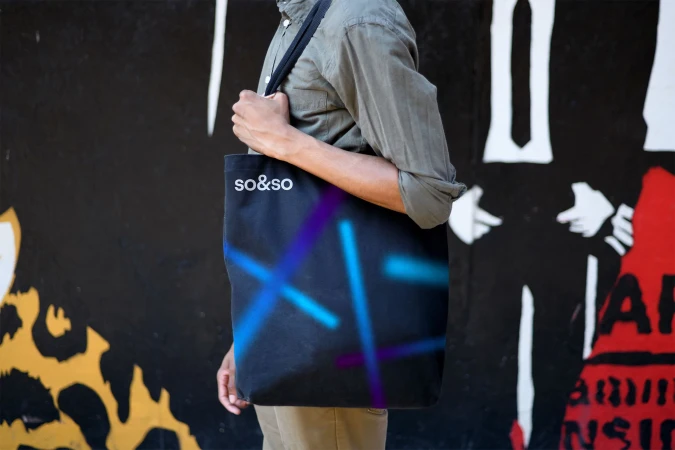
Close-up of a printed booklet with minimal sans-serif typography on white and black pages

so&so Brand Identity 2019

About

This graphic design image showcases a clean brand identity layout for soandso. The composition features printed collateral with minimalist sans-serif typography set against contrasting black and white pages. The typography-heavy spread details the collective's symphony-centric performances, set on smooth paper textures. The overall aesthetic is polished and modern, emphasizing graphic layout and editorial typography.

Brand

Project

Keywords

Credits

Styles

Techniques

Background

Paper Texture

Context

Website / Web
Similar media
Flat lay of stationery and business cards featuring the text 85 Spring St against a clean white background
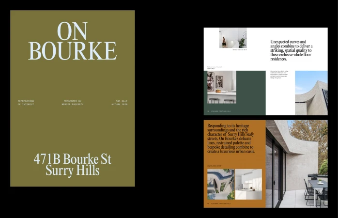
Real estate brochure layout titled On Bourke featuring property photography and typography directed by Madelin Fuller
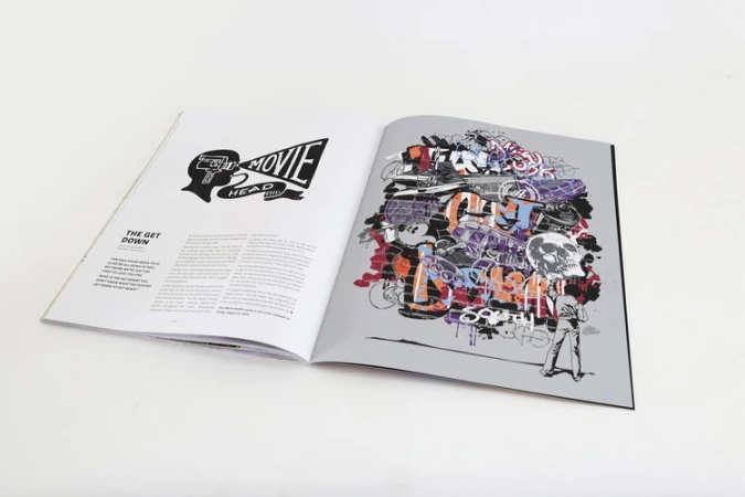
Open magazine spread on white surface featuring graphic typography illustration and detailed graffiti art by Alex Lehours
An open notebook with cream-colored paper displaying brown typography reading The effects of sustainable investing, set against white.
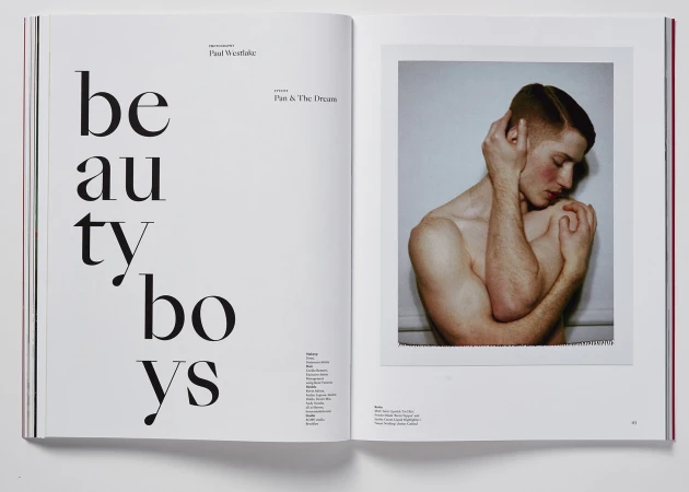
Editorial double-page spread featuring large typography on the left and a framed portrait of a shirtless man touching his head on the right.
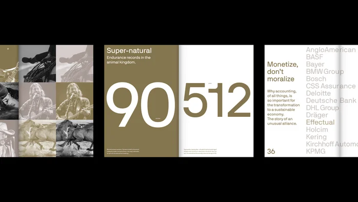
Editorial layout featuring bold typography, large numerals, and muted earthy tones by NAMENAME Creative Partners