
Snog Productions: Brand Identity
Brand
Date
Aug 2021
Description
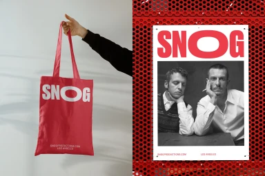
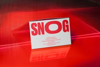
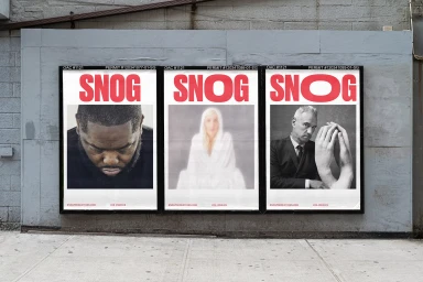
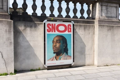
This brand identity project for Snog Productions centres on a bold, high-contrast visual language defined by a vibrant red and crisp white palette. The execution spans digital and physical touchpoints, incorporating clean typography and minimalist layouts to establish a cohesive graphic presence. Developed with graphic design by A LINE, the project utilizes motion graphics and photography to showcase the brand. The application extends across diverse materials, from business cards and promotional tote bags to large-scale outdoor advertising and street-level poster displays.
Style
Horizontal, Commercial, Clean
Color
Pure White
Associated creatives

5000+ creatives to discover
Sign up to gain access to the entire directory. It’s free.
Visie is a curated library of creative professionals.