
Sichuan Fry: Brand Identity
Sep 2023
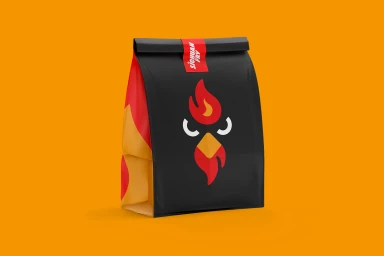
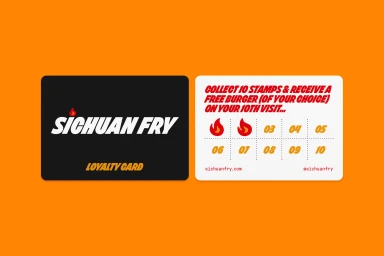
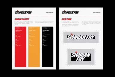
The brand identity for Sichuan Fry, developed by Neighbour, establishes a bold visual language for the fast food restaurant. The project integrates clean, high-contrast graphic design across various touchpoints, including bespoke packaging, loyalty cards, and a digital menu interface. The aesthetic relies on a vibrant palette of red, yellow, and black, anchored by a stylized flame icon and dynamic, slanted typography. Execution spans across physical collateral and digital motion graphics, showcasing a cohesive look that carries through from printed menu boards to web interfaces. The branding leans into a minimalist, vector-led approach, effectively utilising infographics to define safe zones and colour specifications for consistent application. Food photography and live-action sequences of the culinary process further ground the identity, framing the brand within a modern, commercial food and beverage context.
Commercial, Graphic, Horizontal
