
SANA Amsterdam: Brand Identity



Sep 2022
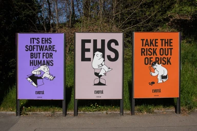
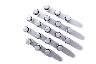
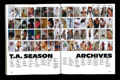
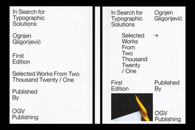
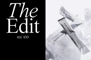
SANA Amsterdam explores a multifaceted visual language through this comprehensive brand identity project. The work encompasses a wide range of applications, spanning from out-of-home advertising installations and transit billboard campaigns to editorial publishing and refined product packaging. Defined by a minimalist aesthetic, the project centers on precise typography and structured layouts. The execution moves between clean, high-key studio photography for cosmetic and supplement packaging and bold, graphic-heavy treatments for public-facing communication. Notable techniques include stark monochrome editorial spreads and the use of high-contrast lighting to accentuate geometric product arrangements. This broad brand identity was realized with contributions from Pano, Madeline Montoya, BRUD Creative, OGV Design Studio, and MONDIAL.
Horizontal, Commercial, Clean, Minimalist
White Seamless


