
Brand
ProjectBrand Identity
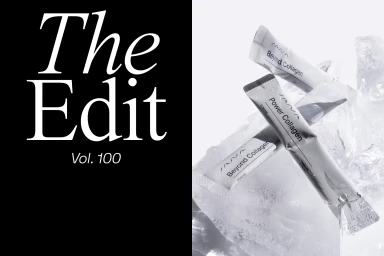
SANA Amsterdam Brand Identity 2022
Associated creatives


Tags
Description
This commercial image for SANA Amsterdam showcases supplement packets resting among textured ice chunks. The clean, minimalist composition features a stark contrast between a solid black left-hand panel displaying white typography and the bright white product display on the right. Sharp lighting highlights the reflective metallic packaging and the glistening texture of the ice. The arrangement presents a pristine aesthetic suited for health and beauty branding.