
SalesWings: Brand Identity


Brand
Date
Sep 2023
Description
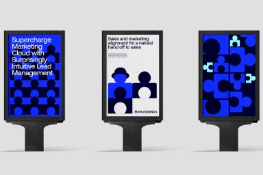
SalesWings presents a comprehensive brand identity system that translates technical marketing alignment concepts into a clean, minimalist visual language. Developed by Mucho, the identity utilizes a high-contrast palette of rich blues, cyan, and deep blacks, pairing custom typography with abstract, geometric graphic elements. The project spans physical and digital touchpoints, integrating corporate branding across outdoor advertising lightboxes, motion graphics, and mobile interface design. Through precise digital motion design and modular vector layouts, the branding establishes a cohesive, modern presence for the technology platform.
Style
Horizontal, Commercial
Industries
Associated creatives

5000+ creatives to discover
Sign up to gain access to the entire directory. It’s free.
Visie is a curated library of creative professionals.