
Salbini: Brand Identity

Jun 2019
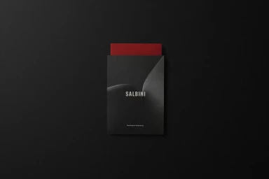
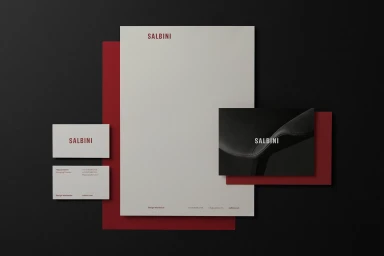
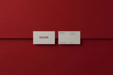
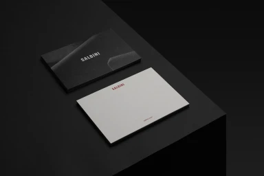
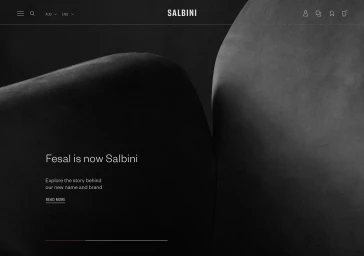
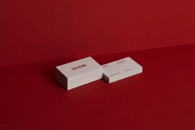
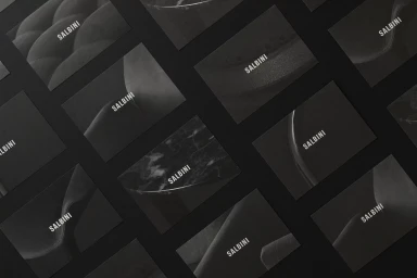
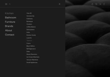
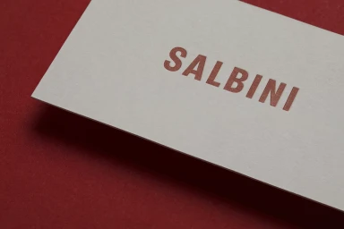
The brand identity for Salbini, crafted with precision by Studio Brave, embodies a sophisticated and minimalist corporate aesthetic that effectively translates across physical stationery and digital interfaces. By utilizing a stark, high-contrast palette of monochromatic black, crisp white, and a signature vibrant red, the design achieves a visual language that feels both authoritative and approachable. The project showcases a masterclass in modern commercial branding, where the deliberate use of typography and geometry creates a cohesive narrative for the luxury interior design space. Across the collateral, from A4 letterheads and business cards to the sleek UI illustration of the website, the identity leans into tactile depth. The application of emboss and deboss techniques on varied matte and textured stocks highlights the premium nature of the furniture brand. The composition frequently employs soft light to elevate the paper quality, ensuring that even the most minimal elements feel intentional and structured. Whether presented as a flat lay of curated stationery or through a dark-mode website navigation menu, the Salbini identity remains anchored by its clean sans-serif wordmark and symmetrical framing. This comprehensive design system succeeds by stripping away the superfluous, allowing the material qualities and precise graphic elements to speak to a high-end, design-conscious audience seeking quality and professional clarity in every detail of the brand experience.
Horizontal, Commercial, Clean, Minimalist
Typography
