Hydrant: Brand Identity


Jan 2020
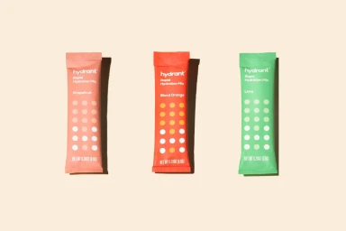
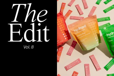
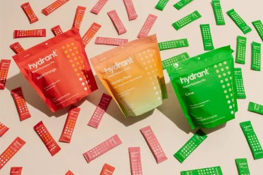
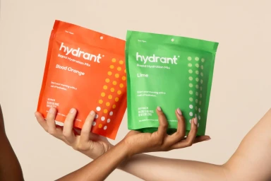
The brand identity work for Hydrant showcases a masterclass in commercial design, effectively distilling complex health supplement branding into a clean, minimalist aesthetic. By leaning into soft light and high-contrast typography, the visual identity navigates the balance between functional utility and shelf-ready appeal. The project utilizes consistent, vibrant color gradients and crisp sans-serif layouts to communicate hydration, while the incorporation of playful graphic elements—such as the whimsical sticker designs and abstract patterns—adds a necessary layer of personality to the consumer-facing collateral. This approach transcends mere product photography; it establishes a cohesive visual language that feels both approachable and professional, mirroring the refined sophistication seen in broader commercial design commissions from studios like Standard Black and Molto Bureau. Through a deliberate focus on structured composition and matte packaging finishes, the identity achieves a sense of intentionality that feels current yet archival. The curation of imagery, ranging from flat-lay product displays to human-centric interaction, highlights the brand's versatility in diverse marketing channels. This body of work underscores the power of a unified design system, where every typographic detail and circular motif serves to reinforce brand recognition, ensuring the identity resonates as strongly in a digital environment as it does on a physical shelf. It is a quintessential example of modern brand development at the intersection of commercial clarity and artistic precision.
Horizontal, Commercial, Clean
E-commerce / Product