
rSIM: Brand Identity
Jan 2024
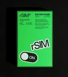
Studio Blackburn developed the brand identity for rSIM, establishing a visual language focused on modern telecommunications and network resilience. The design execution leverages a high-contrast palette of vibrant green and black, utilizing clean geometry and bold sans-serif typography to anchor the brand across both digital and physical touchpoints. The project incorporates motion graphics and fluid animation, moving through dynamic sequences that include data testing motifs, toggle switches, and SIM card iconography. Applications span from 3D rendered digital interfaces on mobile devices to physical packaging design, all unified by a minimalist and structured aesthetic.
Horizontal, Commercial, Graphic
Motion Graphics
Brand Film / Corporate Video
