
Rooftop at QT: Brand Identity
Aug 2021
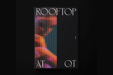
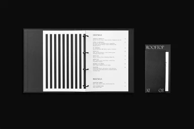
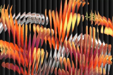
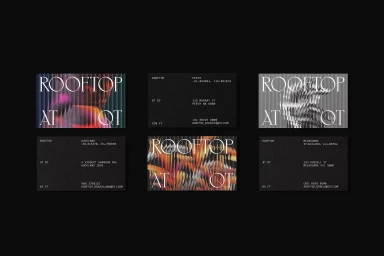
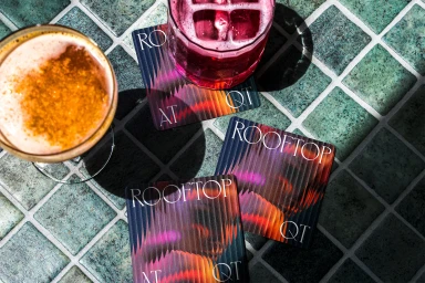
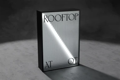
Rooftop at QT introduces a refreshed brand identity that balances minimalist precision with high-contrast, artistic visuals. The project, led by Toben, spans across printed collateral including menu booklets, business cards, and signage, alongside motion graphics that translate the identity into a dynamic digital environment. The design language relies on a moody, monochromatic foundation punctuated by warm, saturated accents and corrugated textures. Sleek serif typography is used throughout, anchoring the more experimental graphic elements like sliced-lens distortions and metallic 3D renders. This interplay of clean, industrial surfaces and vibrant botanical motifs establishes a sophisticated atmosphere.
Commercial, Clean, Horizontal
Typography
Black Seamless
