
Rohling: Brand Identity


Apr 2025
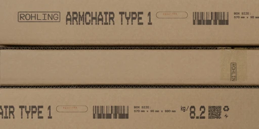
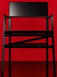
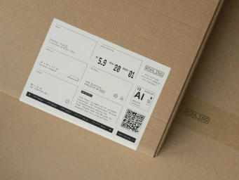
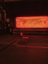
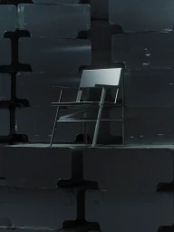
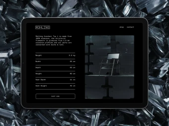
The brand identity for Rohling encompasses a comprehensive visual system developed for their Armchair Type 1, integrating industrial design specifications with a minimalist graphic language. Art directed by Ten Letters, the project balances raw, tactile manufacturing elements with clean, modern product photography captured by Klemen Ilovar. The creative execution utilizes a palette of monochromatic tones, industrial textures, and bold typography to highlight the chair's geometric form. Across both print and digital assets, the work leans into a functional aesthetic, featuring grid-based technical layouts and stenciled packaging details. Chair design is credited to Gil Russ and Brian Chen, whose focus on structural precision informs the overall brand direction.
Horizontal, Commercial, Clean


