
Rerun is hard and human at the same time
Brand Identity
Jun 2026
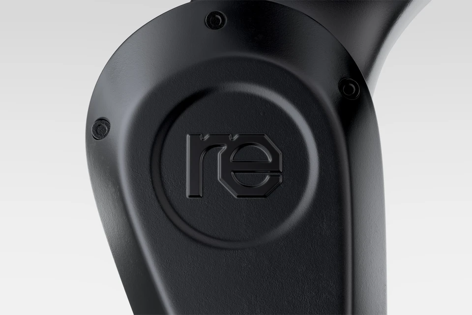
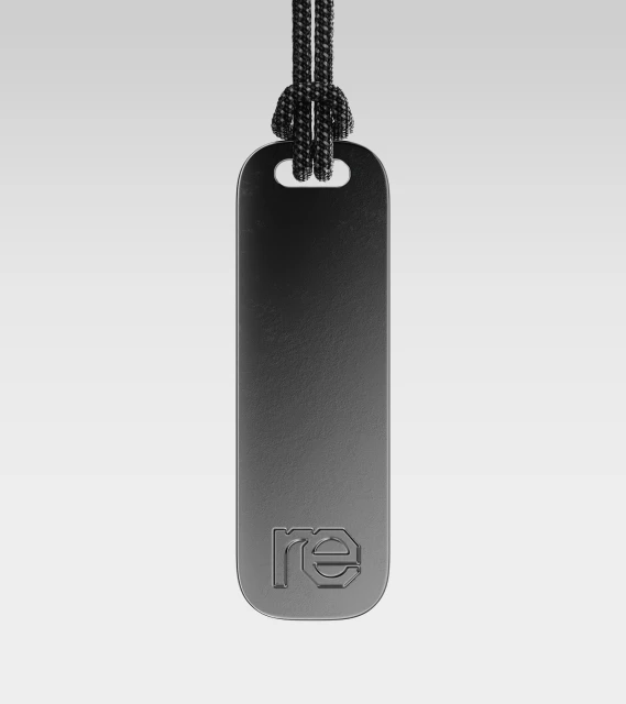
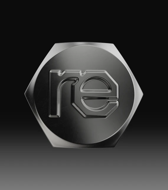
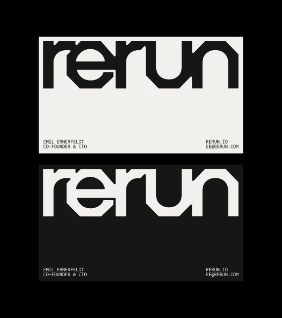
The brand identity for Rerun strikes a delicate balance between industrial precision and modern minimalism, grounding a forward-thinking ethos in tangible, heavy-duty materiality. Spearheaded by the design expertise of Studio Gruhl, the visual system pivots away from decorative excess, favoring a functionalist approach that mirrors the brand's commitment to durability and seamless performance. The identity is defined by a clean, geometric sans-serif logotype that feels both authoritative and approachable, effectively translating across a variety of applications from embossed industrial hardware to crisp, high-contrast stationery. Through the strategic use of studio strobe photography, the project elevates everyday objects like metal pendants and bolted emblems into elevated brand touchpoints, emphasizing the tactile quality of matte black finishes and sharp, deliberate engravings. This focus on materiality is complemented by a restrained color palette that leans into neutral beige and deep charcoal gradients, creating a sophisticated backdrop for bold, impactful typography. Whether rendered as a 3D graphic or printed on premium business cards, the system channels a sense of intentionality and streamlined efficiency. By prioritizing clean lines and negative space, Studio Gruhl has constructed a cohesive visual language that feels grounded in reality while maintaining a polished, professional edge that signals quality to an audience that values substance over stylistic flourish in their industrial and creative products.
Minimalist, Horizontal, Commercial
