
REF
Brand Identity
Jun 2017
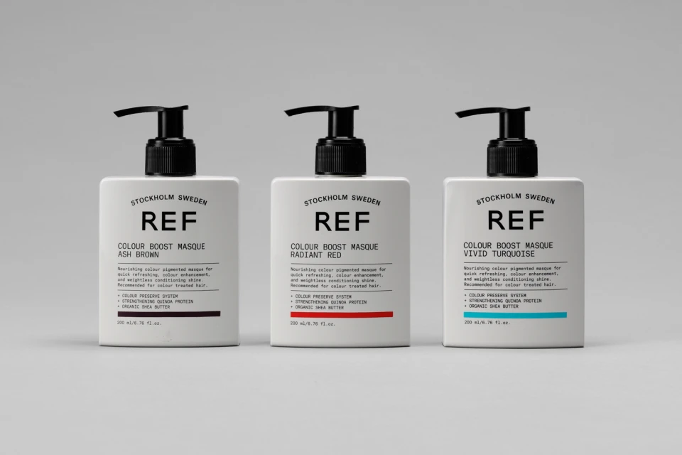
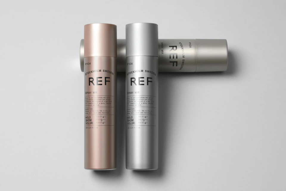
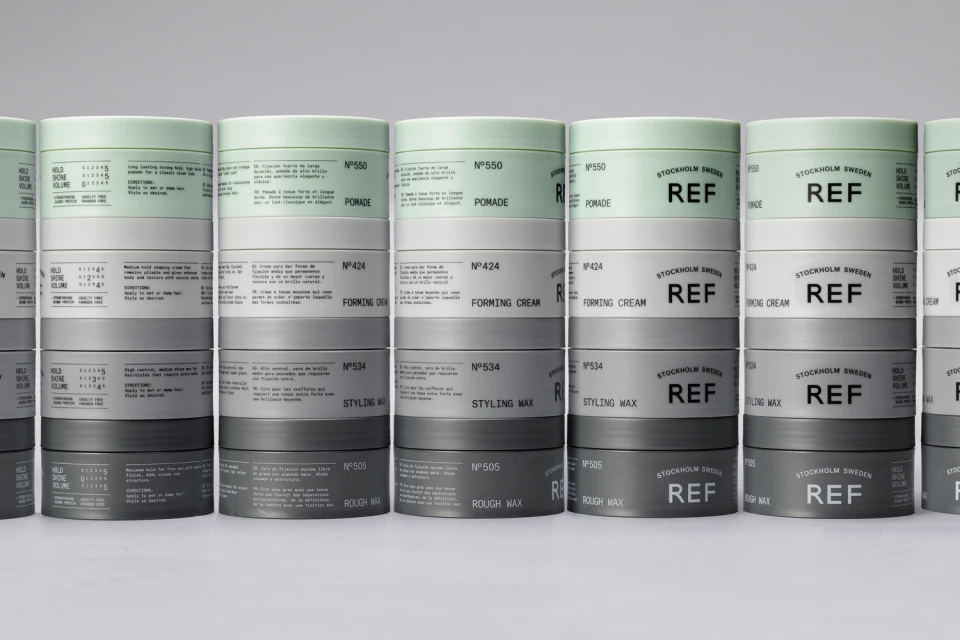
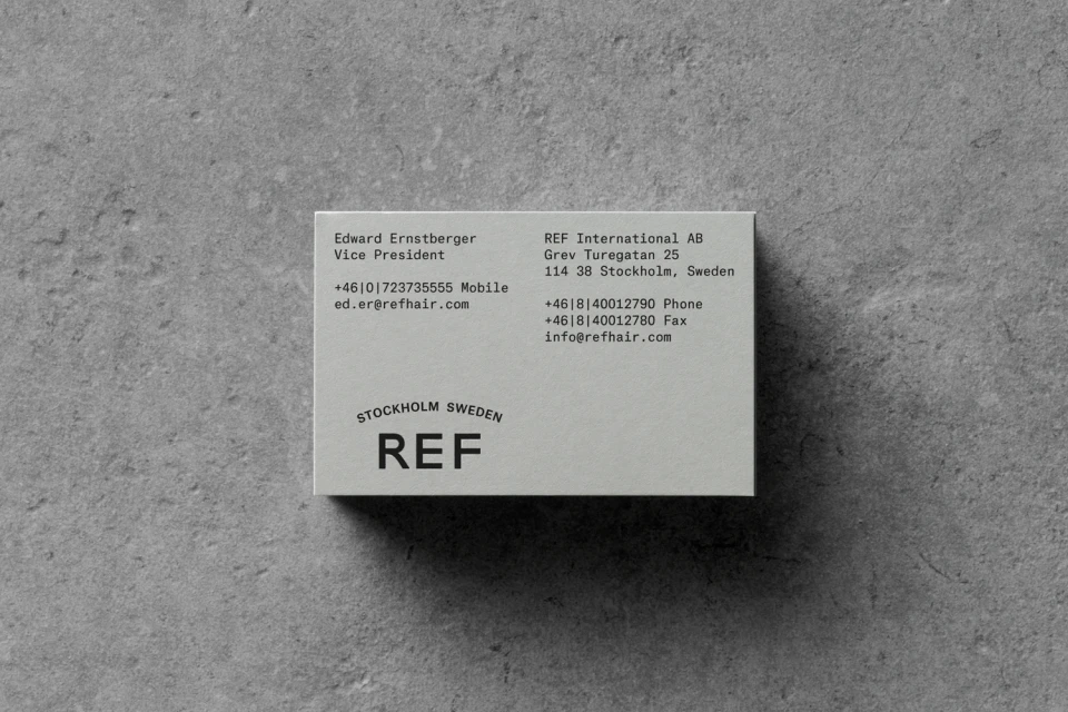
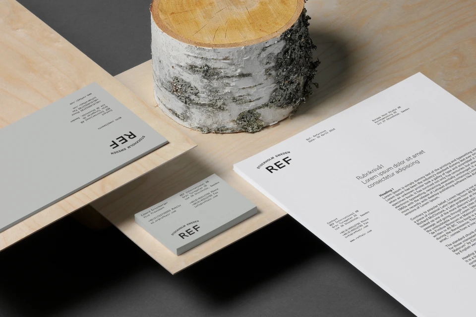
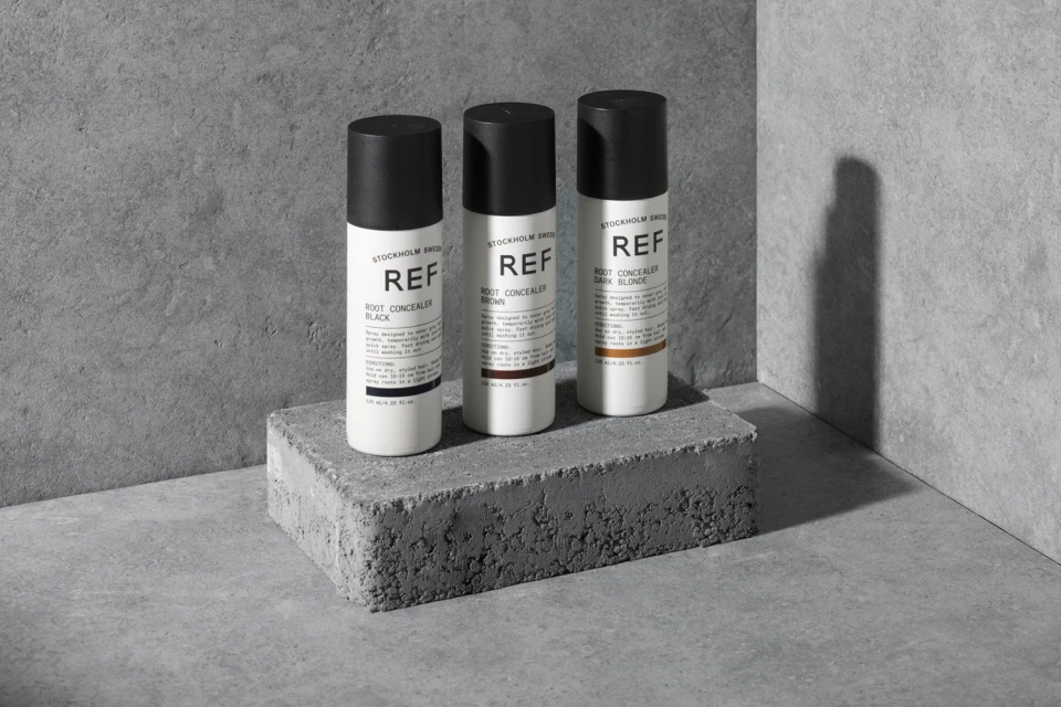
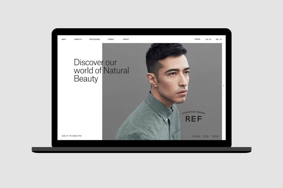
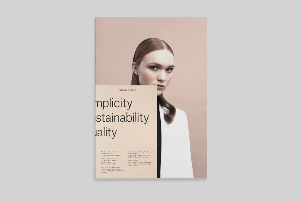
The brand identity for REF Stockholm Sweden establishes a sophisticated visual language that effortlessly bridges the gap between clinical efficiency and organic beauty. By leaning into a strictly minimalist aesthetic, the project successfully defines the haircare brand through a consistent use of clean, sans-serif typography and a subdued, neutral color palette that echoes the serenity of its Scandinavian roots. Through the expert graphic design work of Kurppa Hosk, the brand identity project creates a cohesive narrative across diverse touchpoints, from high-key studio packshots of styling masques and aerosols to professional stationery suites. The execution relies on precise commercial photography, utilizing studio strobe lighting to emphasize the matte textures of product packaging and the industrial interplay between smooth containers and concrete surfaces. This clinical, orderly approach to design is softened by editorial portraiture and natural accents, such as birch log elements, which ground the corporate visuals in a sense of natural quality. The resulting identity feels deliberate and high-end, favoring editorial minimalism to communicate the brand's commitment to sustainability and professional-grade performance. By maintaining a balance between rigid structural composition and soft, high-contrast imagery, the identity provides a versatile framework for both digital UI and physical media, ensuring that the brand remains instantly recognizable as a leader in the global beauty industry.
Horizontal, Commercial, Clean, Minimalist
Haircare
